Roman Numeral Date Tattoos: 12 Layouts Done Right
Roman numeral dates look effortless until someone spells 1999 wrong in permanent ink. Here is the conversion logic, the format decisions, a proofreading routine, and 12 layouts that hold up on skin.
Seven Symbols and the Rule That Trips People Up
Roman numerals run on seven letters, and every date you will ever tattoo is built from them:
- I = 1
- V = 5
- X = 10
- L = 50
- C = 100
- D = 500
- M = 1000
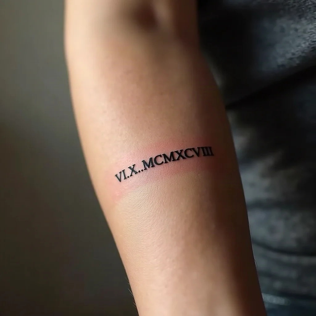
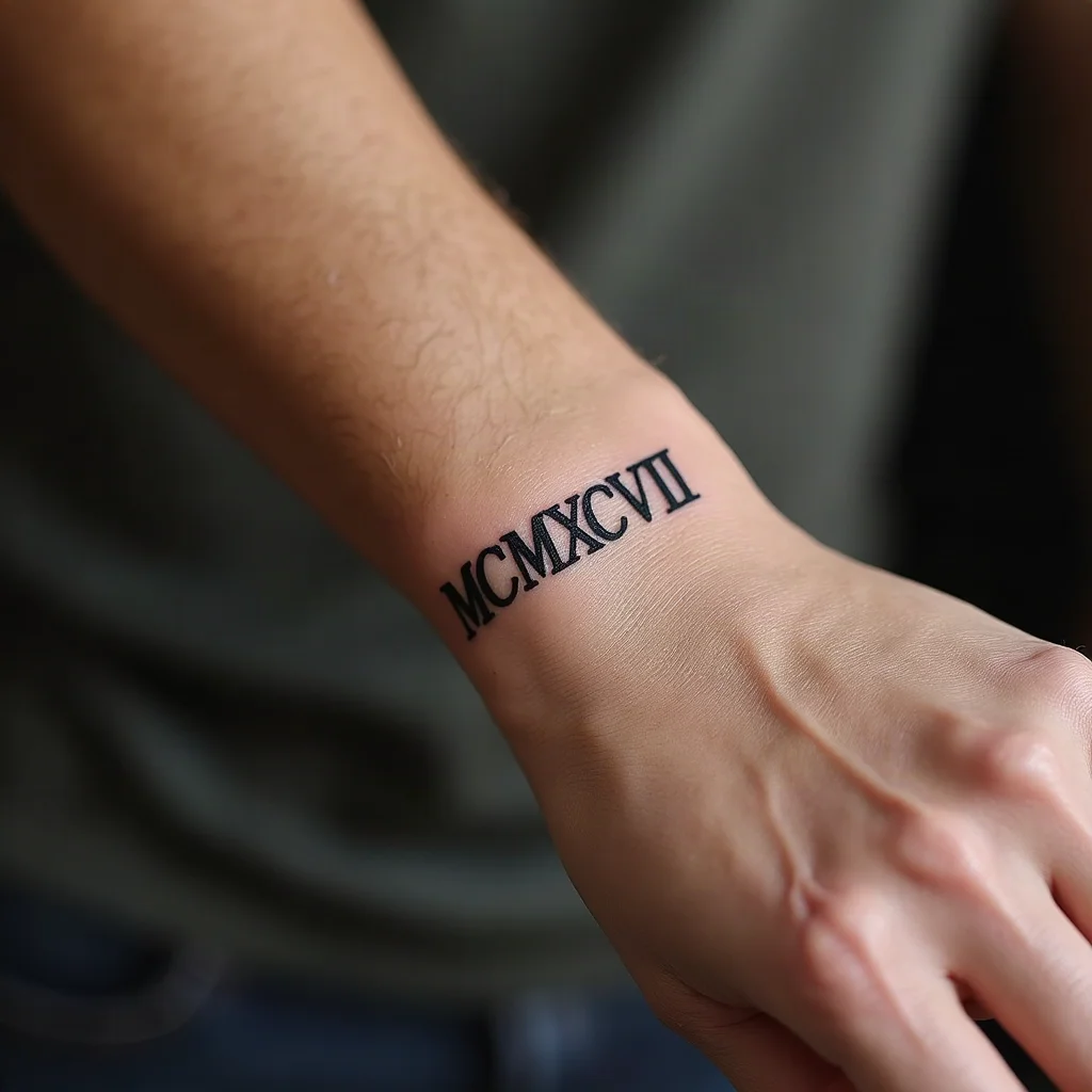
Build a number by breaking it into thousands, hundreds, tens and ones, converting each chunk, then writing them left to right from largest to smallest. Take 1998: 1000 is M, 900 is CM, 90 is XC, 8 is VIII. Strung together that is MCMXCVIII. Take 2024: 2000 is MM, 20 is XX, 4 is IV, so MMXXIV.
The rule people get wrong is subtractive notation. You never write four identical letters in a row, so 4 is IV (one before five), 9 is IX, 40 is XL, 90 is XC, 400 is CD and 900 is CM. That is why 1999 is MCMXCIX and never IM or MIM, and why the ninth month is IX rather than VIIII. Clock faces sometimes use IIII for four, which is a design tradition, not correct notation. If you want that look, say so out loud to your artist so nobody assumes it is a typo.
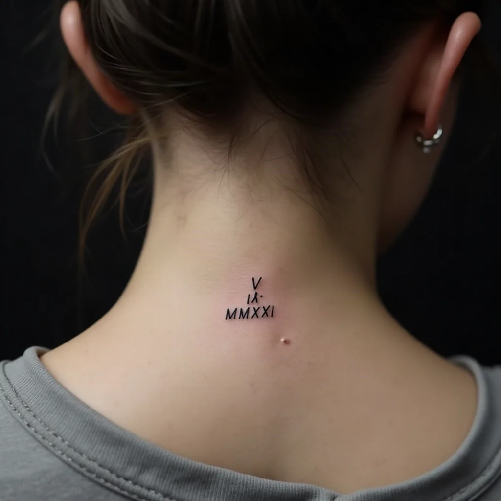
The other thing to absorb: there is no zero and no leading zero. A date written 05.09.2021 on a form becomes V . IX . MMXXI on skin. Nothing stands in for the empty digit, so short numbers just look short, and that is correct.
Two full worked examples: 7 November 1998 is VII . XI . MCMXCVIII, and 23 March 2024 is XXIII . III . MMXXIV.
Choosing a Format: Day First, Month First, or Year Only
Roman numerals carry no built-in date order, so the sequence you choose is the sequence people will read. Decide it before the stencil, not on the chair.
- DD . MM . YYYY — the international order, and the most common choice for tattoos because it moves from smallest unit to largest.
- MM . DD . YYYY — the US order. Fine, but expect friends to misread it, especially when both numbers are under 13.
- YYYY only — a graduation year, a birth year, the year you got sober. Short, balanced, and easy to place anywhere.
- MM . YYYY — a soft option when the month matters more than the exact day.
Ambiguity is real: VII . XI could be 7 November or 11 July. If the date needs to be unmistakable to strangers, pick a format and be at peace with it, or use a design cue such as a birth flower for the month.
Separators change the whole feel
Middots or interpuncts (VII · XI · MCMXCVIII) look modern and keep the groups readable. Full stops feel classical. Slashes read like a form. Hyphens read like a range and can be confusing on a memorial piece where a dash already means to. Simple gaps, with about one letter-width of space between groups, are the cleanest of all, but they demand steady spacing from the artist.
Whatever you choose, apply it consistently, and check that your separator does not collide with a letter I at small sizes. Dots placed too close to an I can blur into a single mark once the ink settles.
Proofread Like a Printer: A Six-Step Check
Nearly every regretted numeral tattoo comes from a conversion nobody double-checked. Treat the stencil like a proof sheet.
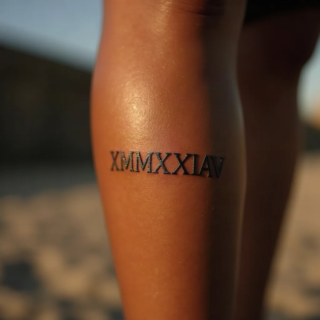
- Convert it yourself on paper first. Break the number into thousands, hundreds, tens and ones and write each chunk before joining them. Do not paste from a random converter and trust it blindly.
- Have a second person convert it independently without seeing your version, then compare. Two matching answers is a real check; one answer is a guess.
- Convert backwards. Read the finished string and add the values up out loud. MCMXCVIII becomes 1000 + 900 + 90 + 8. If the total is not your date, stop.
- Count the characters in your written note and in the stencil. A missing I is the single most common error, and long strings like MDCCCLXXXVIII hide it well.
- Photograph the stencil on your skin and zoom in. Mistakes jump out on a phone screen that your eye skates over in a mirror.
- Say the date out loud to your artist before the first line. Not the numerals, the actual date. It is the last chance for someone to say wait, that is the wrong month.
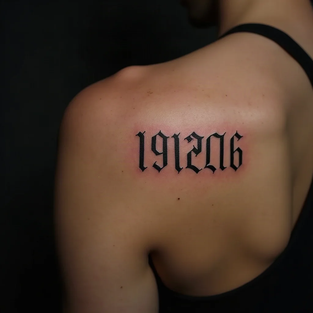
Fonts matter here too. Sans-serif capitals turn VIII into a picket fence that is hard to count at a glance, while a serif face gives each I little feet that separate it from its neighbours. If you want sans-serif, ask for wider letter spacing to compensate. And confirm the letter I is a plain vertical bar, not a lowercase-style form with a dot, which will read as an entirely different character once healed.
6 Clean Single-Line Layouts
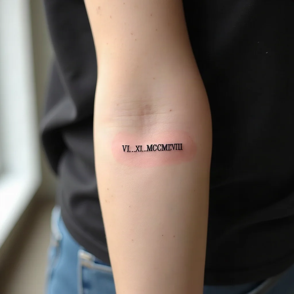
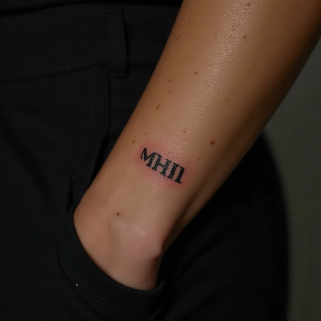
1. Straight line along the inner forearm
The default for a reason: the inner forearm is flat, low-friction and gives you 4 to 6 inches of clean runway, so even a long year like MDCCCLXXXVIII fits without shrinking the letters. Run it parallel to the arm so it reads when you turn your palm up. Keep letter height around a third of an inch and the numerals stay crisp for decades.
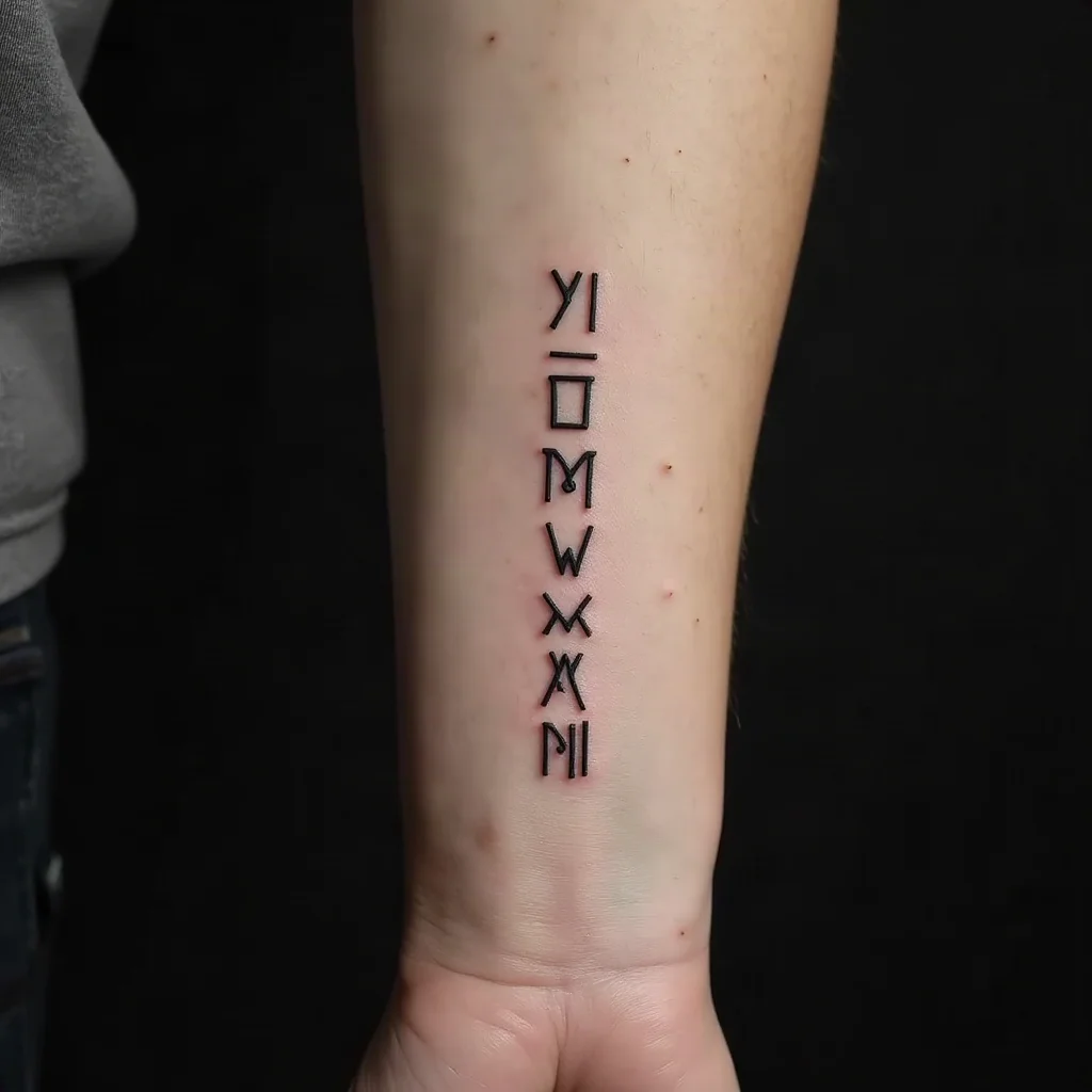
2. Vertical date down the side of the wrist
Letters stacked one above the other along the wrist's outer edge, reading top to bottom, roughly 2 to 3 inches long. It hides under a watch strap and shows when your arm hangs at your side. Because the area is narrow, this suits a year alone or a short day-month pair rather than a full three-group date.
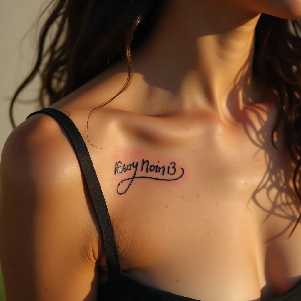
3. Underscored date on the collarbone
A single line of numerals following the bone, with a hairline rule drawn underneath like a signature. The underline gives an otherwise plain string a deliberate, designed feel and helps anchor the eye. Expect a sharper sting over bone, but the sitting is short.
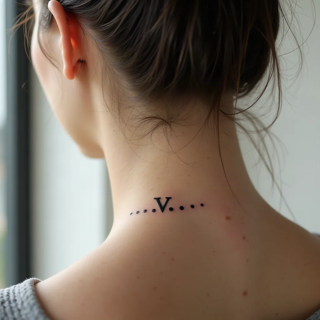
4. Micro date with dot separators behind the ear
An inch to an inch and a half of tiny numerals tucked in the hollow behind the ear, with round dots between the groups. It is the most discreet place for a date, though skin here turns over fast and thin lines can soften, so build a touch-up into your plan.
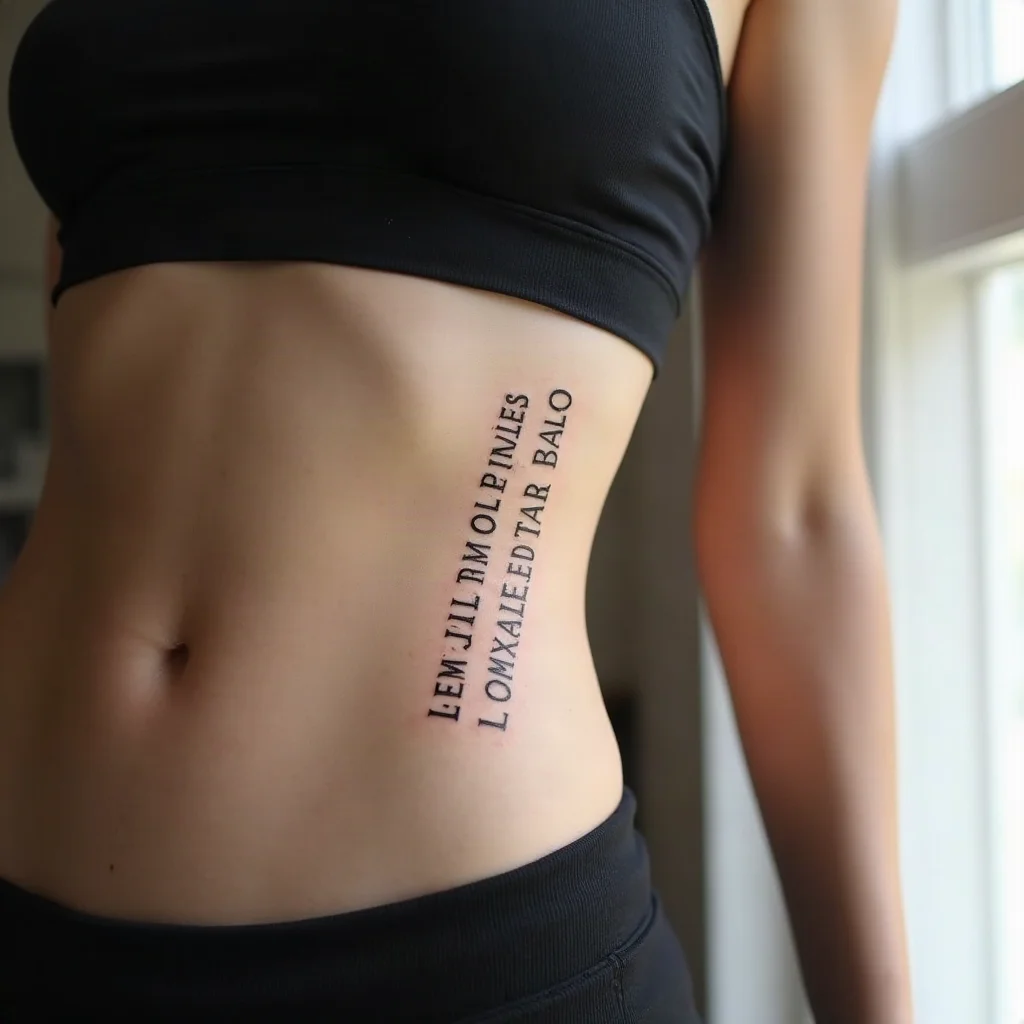
5. Rib-line date following the ribcage
Set the numerals on a long diagonal that follows a rib, reading downward, at 5 to 7 inches. The length lets you use generous spacing between groups so the date breathes. Ribs are among the more demanding spots to sit through, so keep the session short and the design linear.
6. Slim date band on the inside of a finger
A year in small capitals along the inner side of the index or ring finger. It is charming and completely hidden when your hand is closed, but be honest with yourself: finger ink fades, spreads and often needs redoing within a couple of years. Choose it because you like the ritual of upkeep, not despite it.
6 Stacked, Curved and Combined Layouts
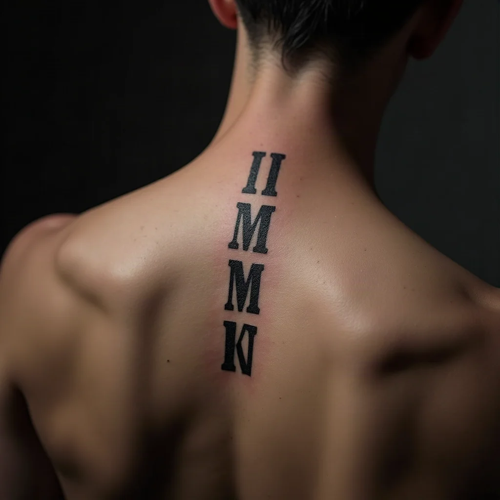
7. Three-tier stacked block on the spine
Day, month and year on three centred lines, each group aligned to the same axis so the block sits like a monument over the vertebrae. Around 2 inches wide and 3 tall works for most backs. Bold slab serifs suit this one; hairlines get lost against the shadow of the spine.
8. Arc curving under the shoulder blade
The numerals bend along a gentle arc, following the curve of the scapula rather than fighting it. At 4 to 6 inches it feels like an inscription on a monument. Ask your artist to letter on a drawn guide curve so the baseline stays smooth, not wobbly.
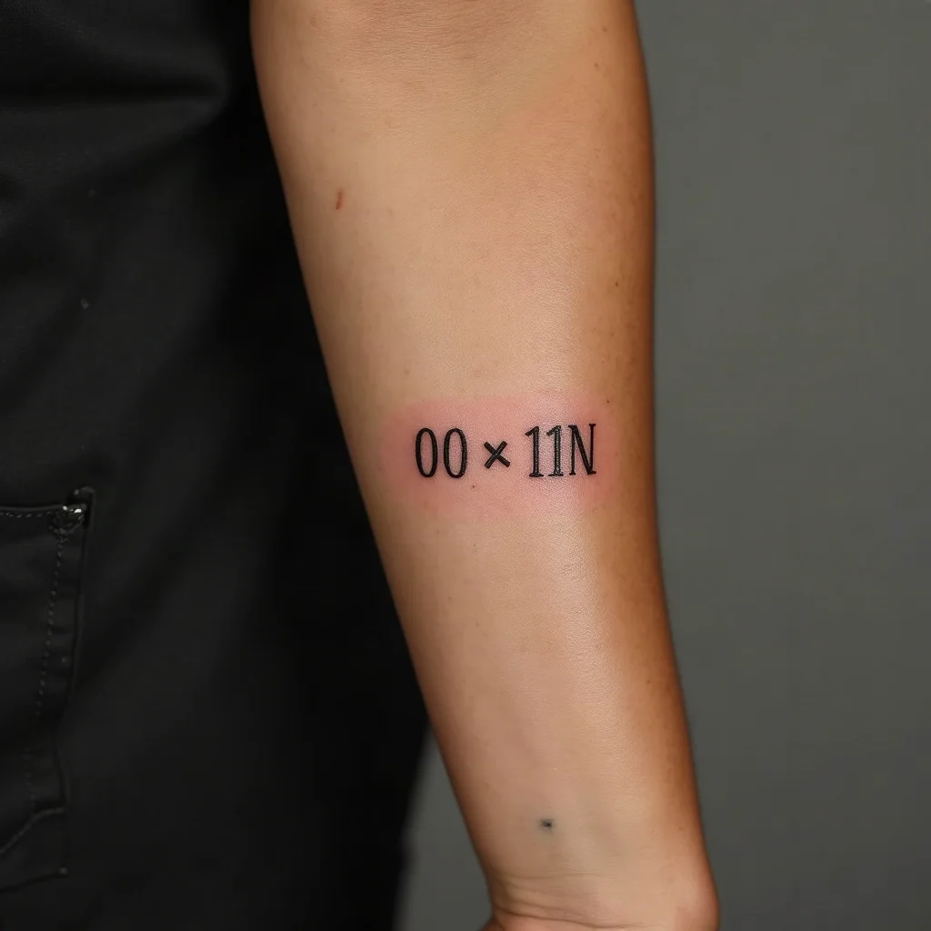
9. Two dates joined by an en dash
The memorial layout: birth date, a short dash, passing date, run along the outer forearm where the skin is broad and flat. Keep the dash noticeably shorter than the numeral groups so it never reads as a stray I. Many people split the two dates across opposite arms instead, which turns the piece into something only they can read whole.
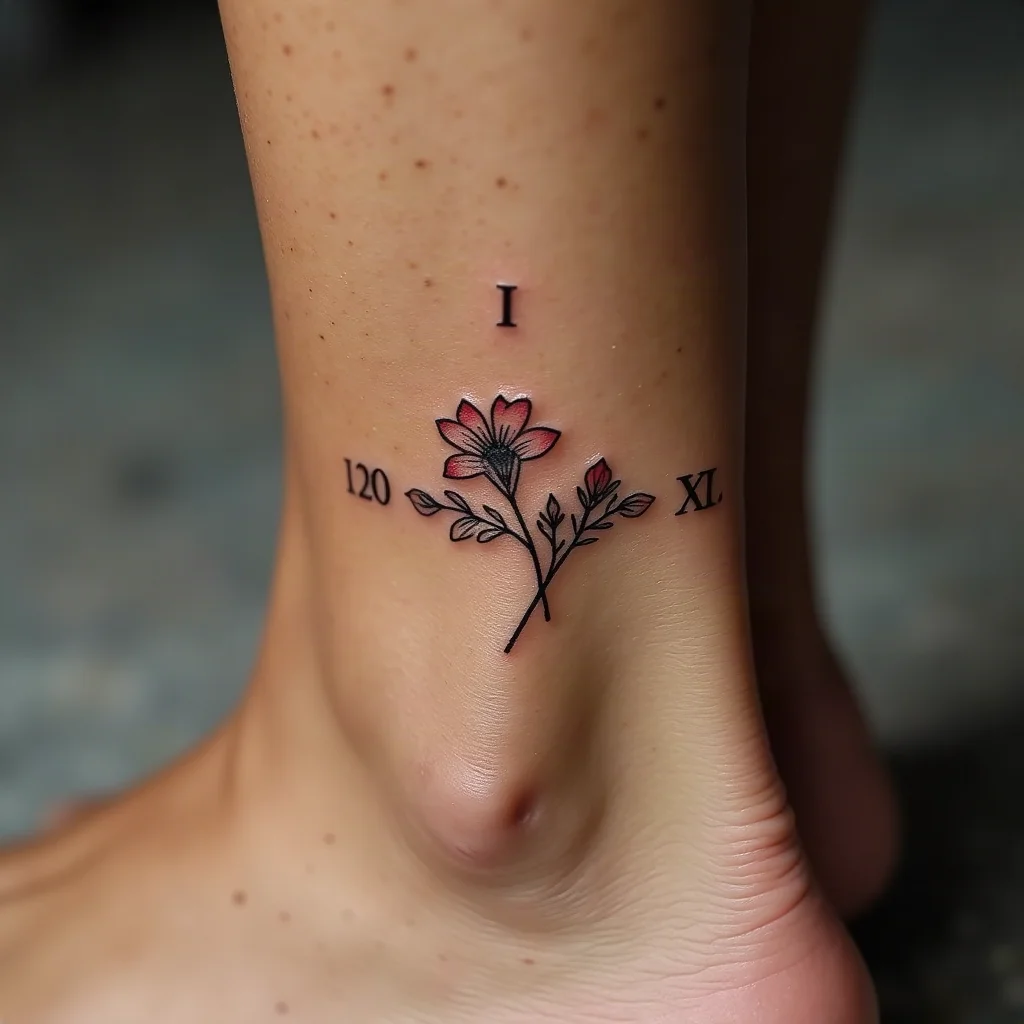
10. Numerals threaded through a birth-flower sprig
A small stem of the month's flower curls behind the date so the greenery and the numbers share one composition. It solves the ambiguity problem beautifully: the flower states the month, the numerals state the day and year. The ankle takes this at 3 to 4 inches; the same idea scales up on a thigh.
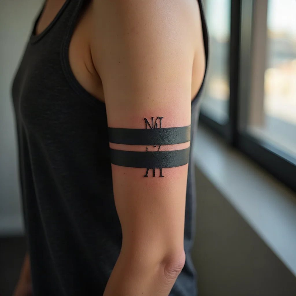
11. Numerals set into a bicep armband
A solid or double-line band around the upper arm, broken at the outer face where the date sits in negative space. The black frame gives the numerals weight without making them large, and the band reads as a design element from across a room. Pairs naturally with an existing armband if you already have one.
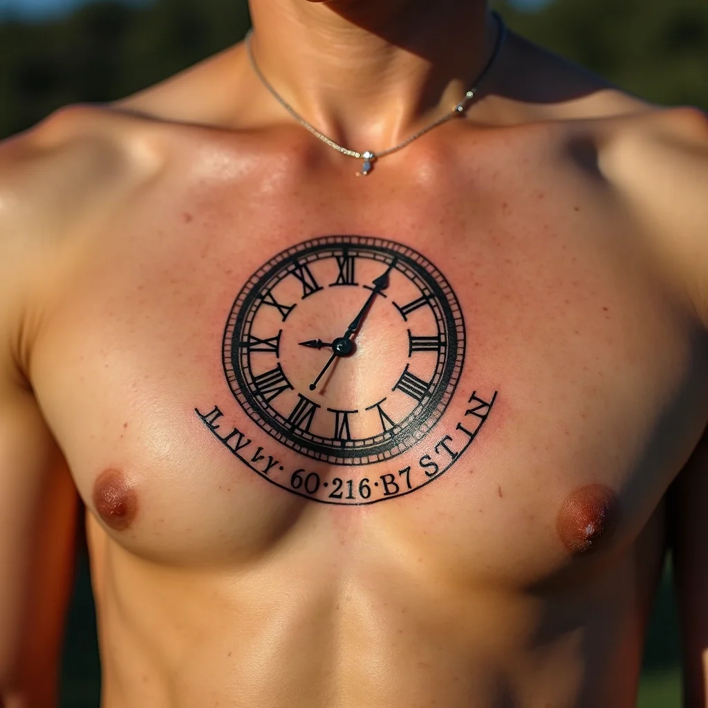
12. Clock face with the date curved beneath
An illustrative clock with Roman hour markers, hands set to the exact time, and the date arcing below it. This is the one layout where IIII at the four o'clock position is historically appropriate. Plan for 5 inches or more across the chest so the numerals on the dial stay readable as the tattoo ages.
Sizing, Placement and How Numerals Age
Roman numeral dates fail in one specific way: the gaps between letters close up. Ink spreads microscopically in the skin over years, and a string of thin verticals is the worst-case shape for that. Everything below is about buying yourself margin.
Minimum size. For a three-group date, ask for at least 3 inches of total length on the forearm and closer to 4 on the back or chest, where skin moves more. Letter height under a quarter inch with hairline strokes is where legibility starts living on borrowed time. A long 1800s year needs more room than a 2020s one, so measure the actual string, not a generic example.
Spacing over size. If you have to choose, keep the letters small but push the spacing wide. Air between characters is what keeps VIII from becoming a smudge at ten years.
Placement and movement. Flat, stable, mostly covered areas age best: inner and outer forearm, upper back, shoulder blade, ribs, calf. High-friction and high-turnover areas — fingers, palm side of the wrist, the outer edge of the foot — blur faster. Sun exposure is the other quiet enemy; an unprotected forearm date will soften years before a shoulder one.
Pain, honestly. Forearm and outer upper arm are the gentlest and usually done in well under an hour. Collarbone, ribs, spine and sternum sit over bone and vibrate, sharp but brief at this size. Behind the ear is loud more than painful. If you are choosing purely by comfort, our pain chart by placement lines the options up side by side.

Cost, Booking and Keeping the Lines Sharp
A single-line numeral date is usually a shop-minimum job. In most markets that minimum lands somewhere in the low-to-mid three figures, and a simple forearm or wrist date rarely exceeds it. Add ornament — a flower, a clock, a frame, a band — and you move into hourly work, which can run several hundred and up depending on the artist's rate and how much drawing time the piece needs.
Briefing your artist well
- Send the actual date in words ("the seventh of November, nineteen ninety-eight") plus your converted numerals, so the artist can verify rather than retype.
- State your format and separator explicitly: DD . MM . YYYY, middots, no leading zeros.
- Name a font direction — classical serif, slab, engraved, or hand-drawn with slight irregularity — and send one or two references rather than a mood board of twenty.
- Give a measurement in inches or centimetres, and say whether you would rather it be bigger than planned or smaller than planned if it does not fit.
- Ask whether they recommend a slightly heavier line weight for your placement. Experienced letterers will often push for it, and they are usually right.
Healing
Thin lettering heals quickly and undramatically. Keep it clean, apply a thin layer of fragrance-free ointment or lotion for the first week, skip soaking, swimming and direct sun, and do not pick the flakes that form over the letters — that is where patchy lines come from. Once healed, sunscreen is the single best investment in legibility. Fine-line numerals in high-movement areas sometimes need a touch-up after a few months; most artists include the first one free within a set window, so ask when you book rather than assuming.
Frequently asked questions
Do Roman numerals use a zero or leading zeros?
No. There is no symbol for zero in the Roman system, and nothing stands in for a leading zero. A date written 05.09.2021 becomes V . IX . MMXXI, with the short groups simply appearing short. That is correct notation, not a mistake in the stencil.
Should I write the day or the month first?
Either is acceptable, since Roman numerals carry no built-in order. Day-month-year is the more common choice worldwide and reads from smallest unit to largest, while month-day-year matches US convention. Pick one, tell your artist, and accept that anyone reading it may guess the other order when both numbers are under 13.
What is the smallest a Roman numeral date can be tattooed?
For a full three-group date, aim for at least 3 inches of length with letter height around a quarter inch. Go smaller and the vertical strokes in groups like VIII begin closing together as the ink settles over the years. If you want something tiny, tattoo the year alone rather than shrinking the whole date.
Can a wrong Roman numeral tattoo be fixed?
Sometimes. Adding an I or extending a stroke is often possible, but removing a character usually means a cover-up, a redesign that absorbs the error into ornament, or laser work. It is far cheaper to convert the date twice, have someone check it independently, and photograph the stencil before the first line goes in.
Is IIII ever correct instead of IV?
Not in standard notation, where four is always IV. The exception is clock faces, which have used IIII at the four o'clock position for centuries for visual balance. If you are tattooing a clock and want that look, say so clearly so no one assumes it is an error.


The conversation
No comments yet. Got a thought about these designs? Start us off.
Want to weigh in? Join the community to comment, save designs and try them on your skin.