26 Inner Forearm Tattoos for Women That Read Right
The inner forearm is a narrow, soft panel that reads differently depending on which way you run the design. Here are 26 ideas sorted by direction, with honest notes on pain, sizing and how each one ages.
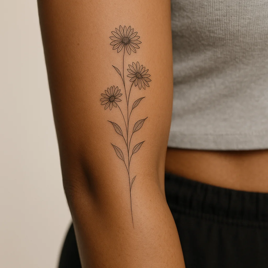
What the inner forearm does to a design
This is one of the few places on the body you see every day without a mirror, which changes what belongs there. Anything you'd want to look at while you're typing, driving or holding a coffee is a candidate; anything designed to impress a room is better on the outer arm, because the inner panel spends most of its life turned toward you.
Physically, it's a forgiving canvas with two catches. The skin is thin, smooth and rarely sun-exposed, so ink holds its crispness here longer than on hands, feet or the outer arm. But the panel narrows sharply toward the wrist and it flexes at both ends. Fine lines placed directly in the elbow ditch or across the wrist crease are the ones that blur first, so most experienced artists leave a finger's width of clearance at each end.
Sizing reality: a typical adult inner forearm gives you roughly a hand's length of usable space and about three to four fingers of width at the widest point. That's generous for a vertical piece and tight for anything meant to be read horizontally, which is exactly why direction matters more here than on any other arm placement.
Pain: honest middle of the road. The soft mid-panel is one of the easier spots on the body. The last inch before the wrist, where nerves sit close and skin is thinnest, is noticeably sharper, and most people describe the elbow ditch as the worst three minutes of the session.
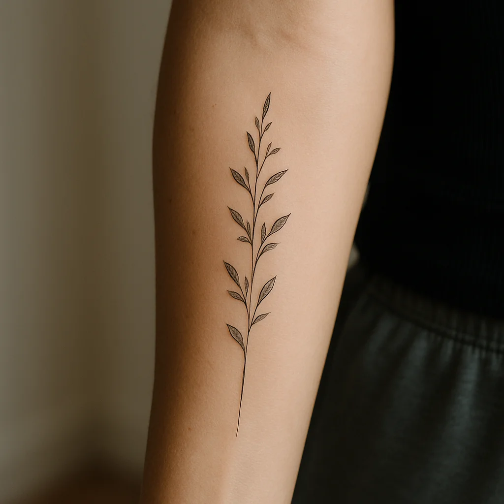
Vertical columns: designs that run wrist to elbow
The long axis is the inner forearm's natural grain. A vertical composition uses the full length of the panel, stays clear of the flex zones and reads correctly when your arm hangs at your side — the position it's in most of the day.
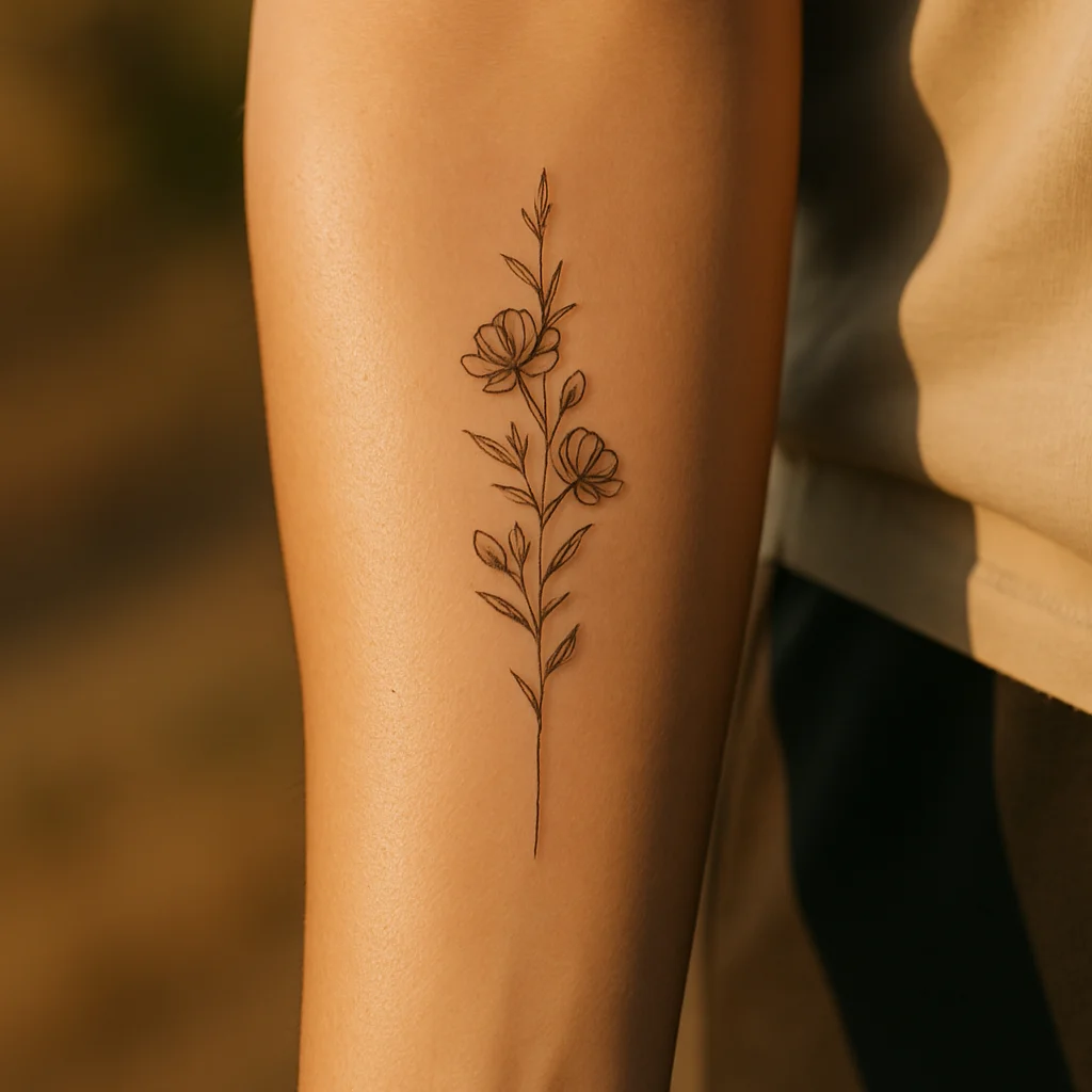
1. Staggered wildflower stem
One continuous stem with three blooms set at different heights, each turned slightly differently so the silhouette isn't repetitive. Cosmos, poppy and yarrow work beautifully together because their heads vary in weight. Sized at about six to eight inches, it fills the panel without crowding it, and the staggering keeps the whole thing from reading like a fence post.
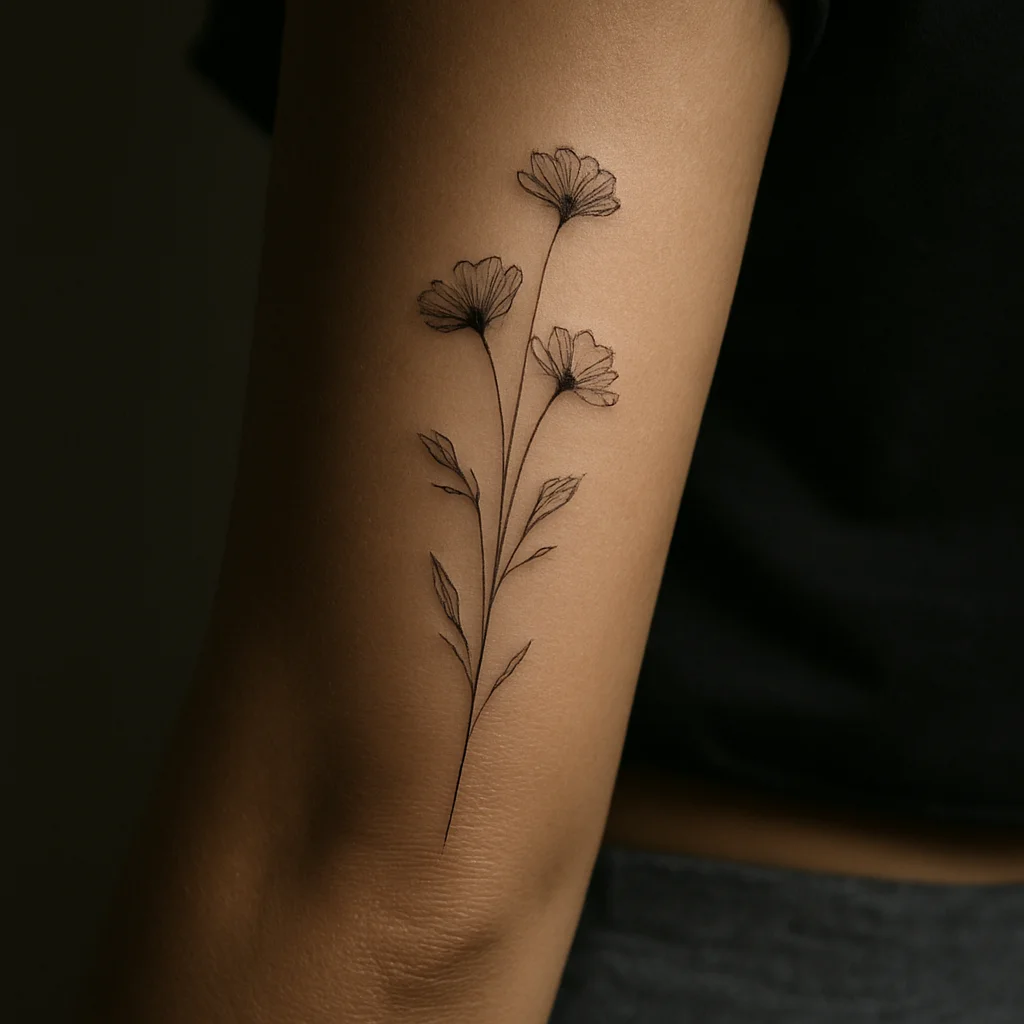
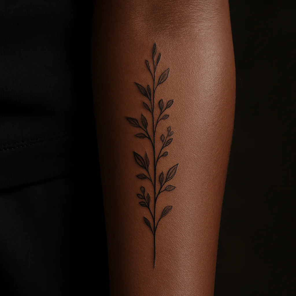
2. Olive branch as a spine
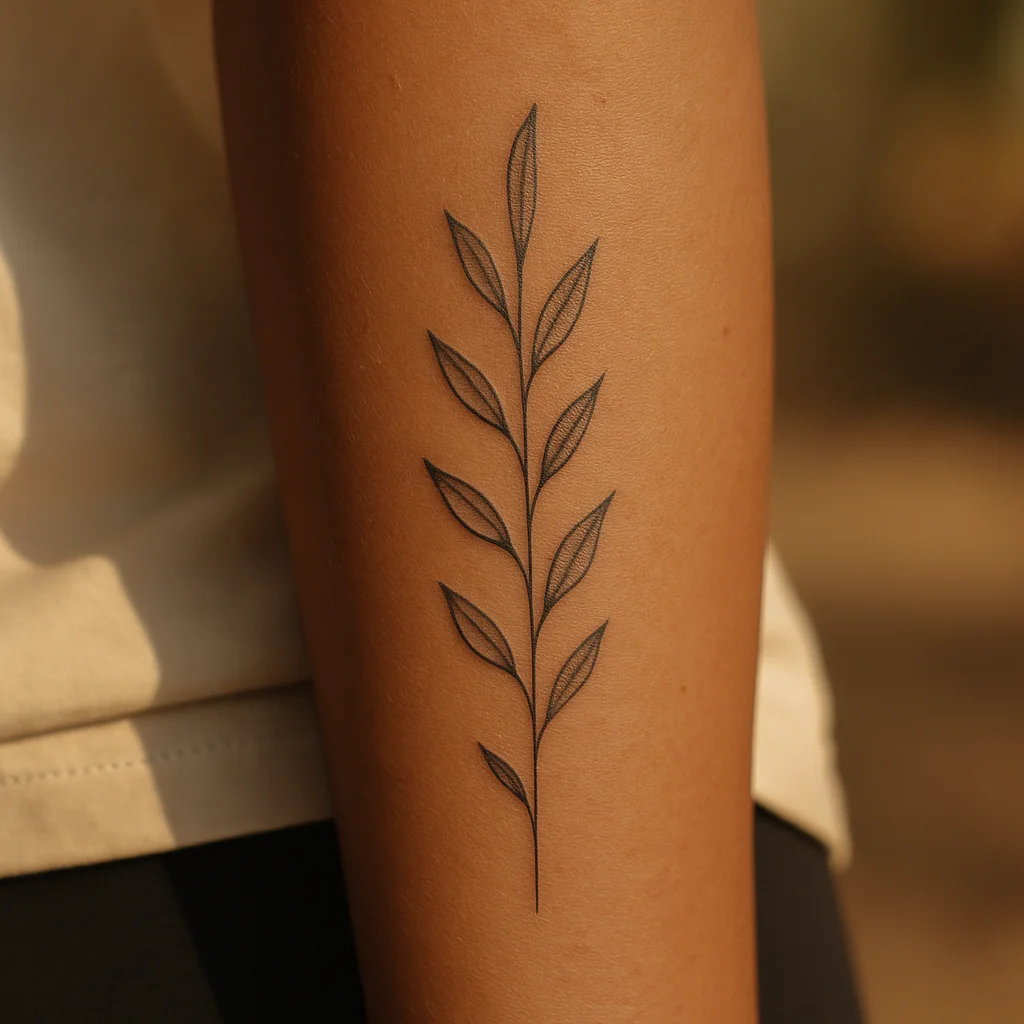
A single olive branch with leaves alternating left and right down the centre line of the arm. It's quiet, it ages exceptionally well because the leaves are solid shapes rather than hairline detail, and it suits anyone who wants something botanical without flowers. Ask for varied leaf sizes — uniform leaves flatten the design.
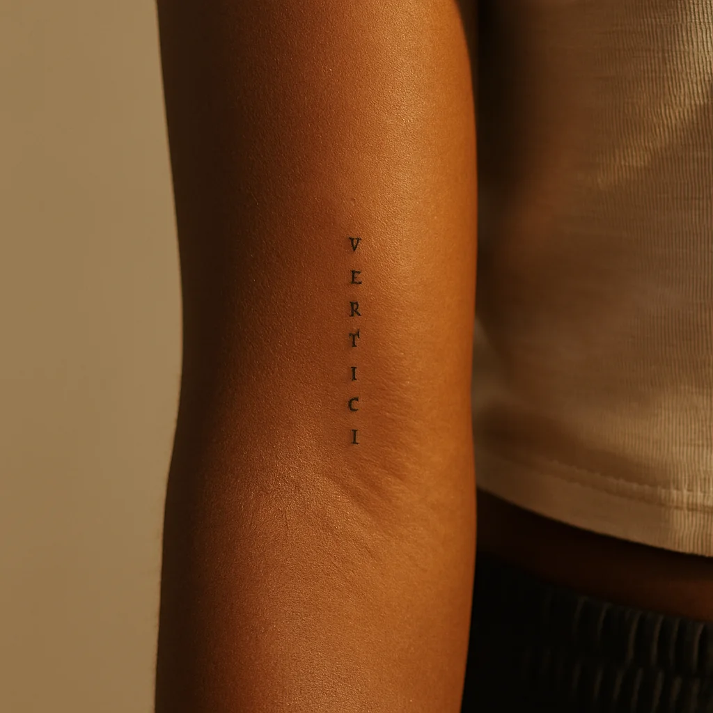
3. Vertical script line
A short phrase set in small caps or a delicate serif, running down the arm so it reads when your palm faces up. Keep it under five words; long sentences in a narrow panel force the letters so small they close up within a decade. A single word in a larger, more confident face usually outlives a whispered sentence.
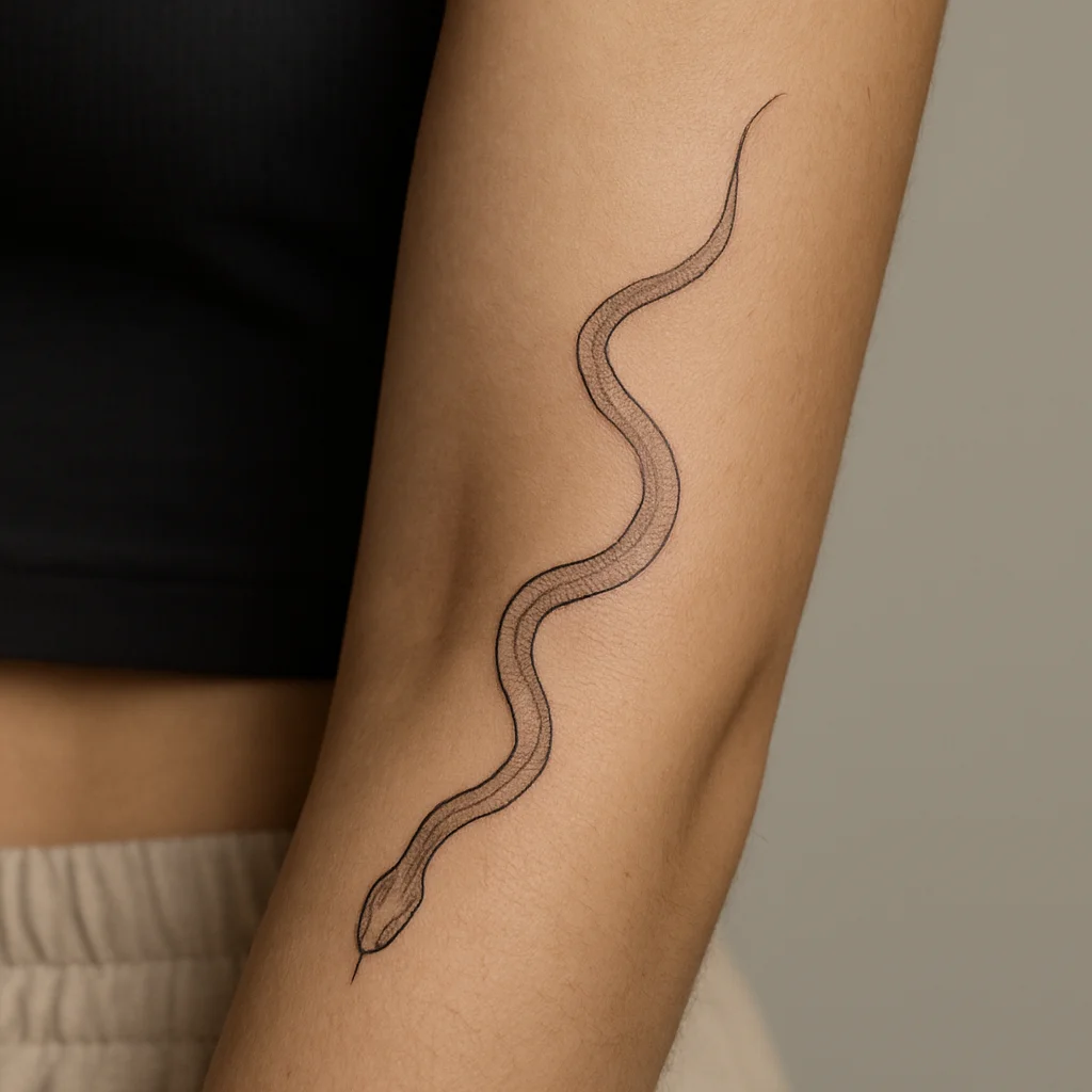
4. Snake down the ulnar edge
A slender snake following the inside edge of the forearm, head near the wrist, tail tapering toward the elbow. The body's natural S-curve suits the slight bow of the arm, and the design flexes convincingly when you turn your wrist. Fine-line with soft stipple shading keeps it elegant rather than heavy.
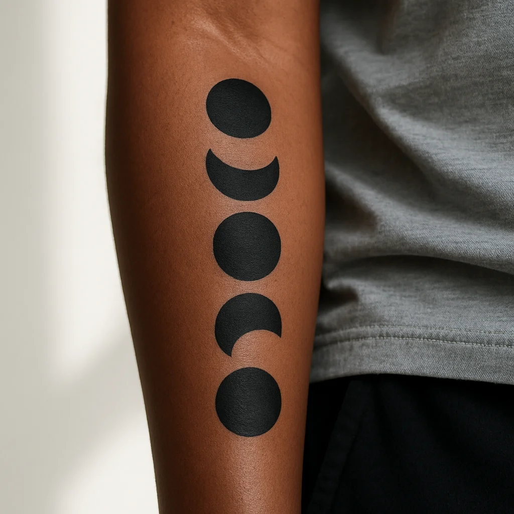
5. Moon phase ladder
Five to seven moons descending the centre of the panel, from new to full and back. It works because the eye follows a rhythm, and it scales down neatly for narrow arms. Solid black fills hold up far better here than delicate crater linework, which tends to soften into grey blobs over time.
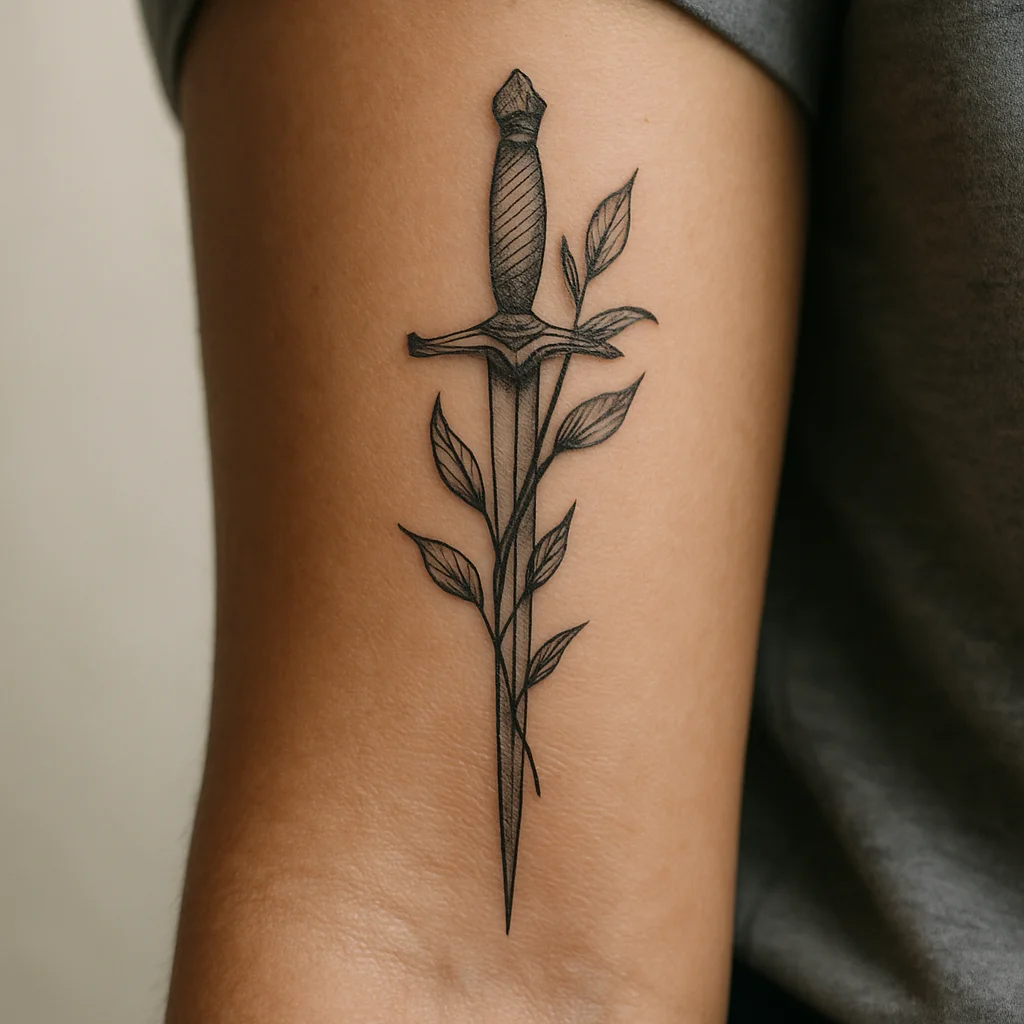
6. Thin dagger with a stem handle
A slim dagger, point toward the wrist, with a botanical stem wrapped around the hilt instead of the usual banner. It's the sharp-edged alternative to a floral column and reads strong at a fairly small width. Great for anyone who wants an inner-arm piece with an edge but not a full traditional panel.
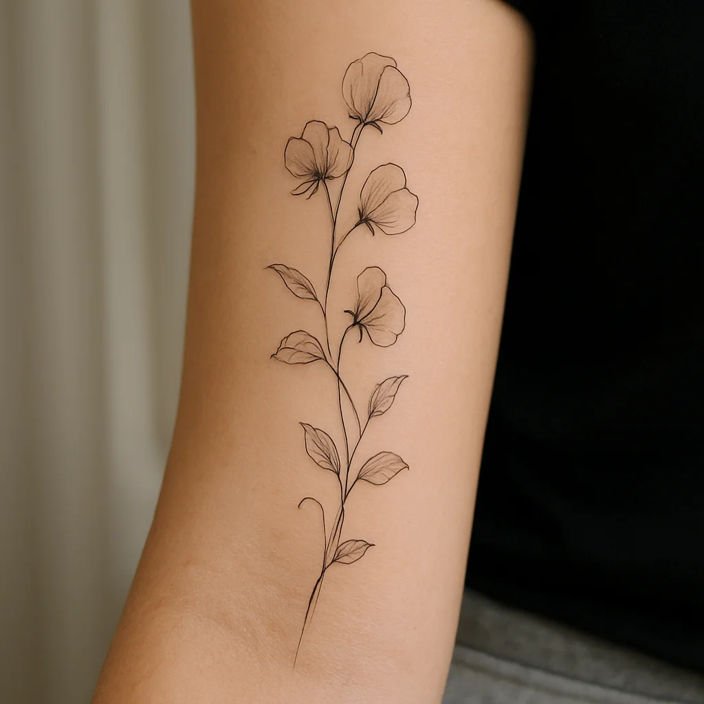
7. Trailing sweet pea vine
A loose vine with deliberate gaps — sections of bare skin where the stem disappears and re-emerges. Those negative-space breaks are what make it feel airy instead of dense, and they give you room to add to the piece later without a redesign. Best at a full wrist-to-elbow run.
Crosswise bands: designs that read across the arm
Running a design across the arm is the harder brief, because you only have three or four fingers of width before it wraps out of view. Done right, though, a horizontal band is striking precisely because it cuts against the limb's grain — and it reads perfectly when your arm is resting palm-up on a table.
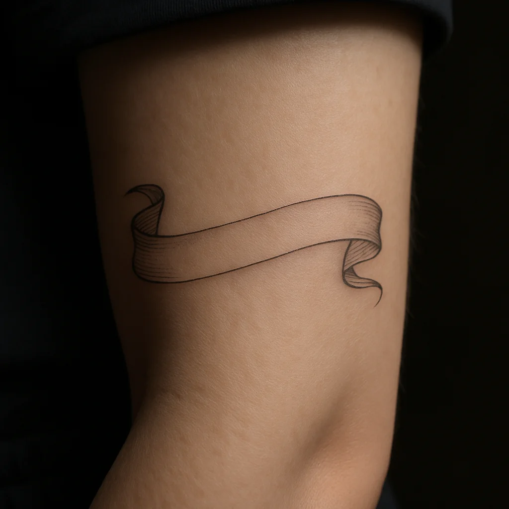
8. Fine-line banner ribbon
A thin ribbon crossing the mid-panel, either blank or carrying two or three words. Let the ends curl slightly around the sides of the arm so it looks like it's wrapping rather than stopping abruptly. Around three inches wide is the sweet spot.
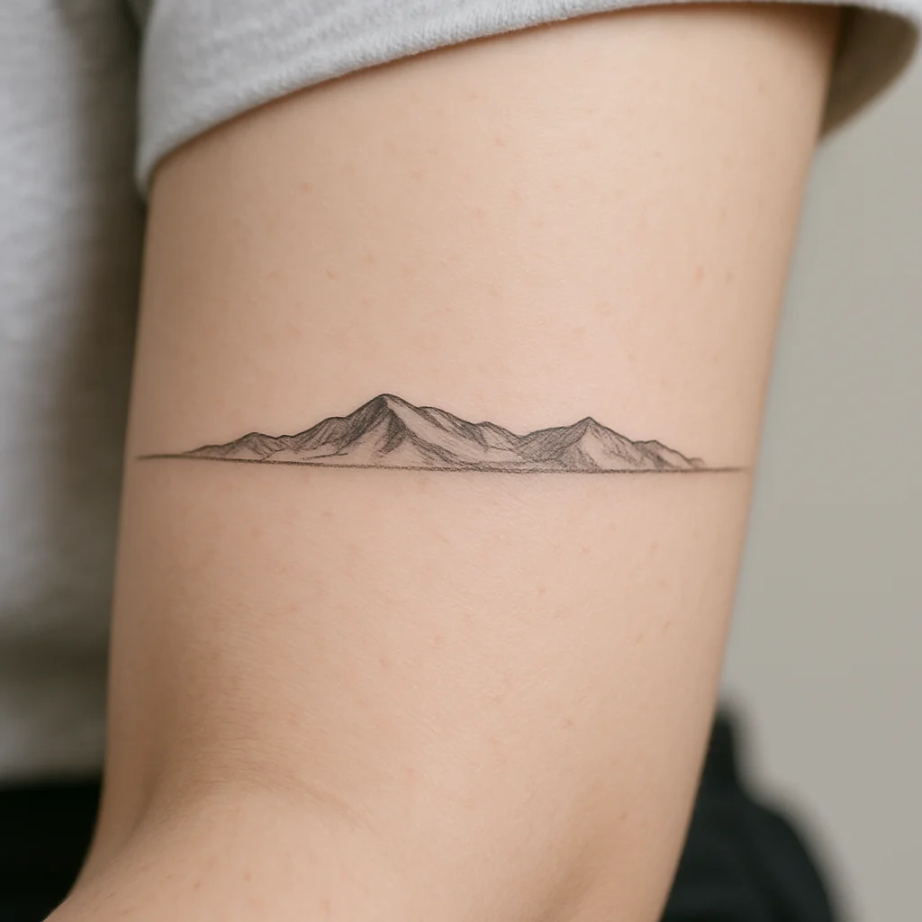
9. Mountain horizon band
A low range of peaks running across the arm with a hairline horizon behind it. Keeping the composition short and wide, rather than tall, makes it feel like a landscape glimpsed through a slot. Add a single line of sky and nothing else — the restraint is the point.
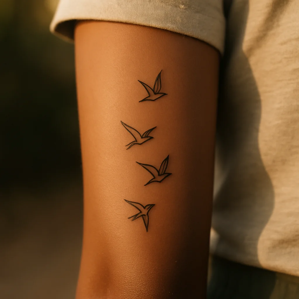
10. Row of birds in flight
Three to five small birds crossing the panel at slightly different heights, the largest nearest the centre. It's a familiar motif that lives or dies on spacing, so ask your artist to place the stencil with real gaps between each bird rather than an even row. Tiny and cheap to start, easy to extend later.
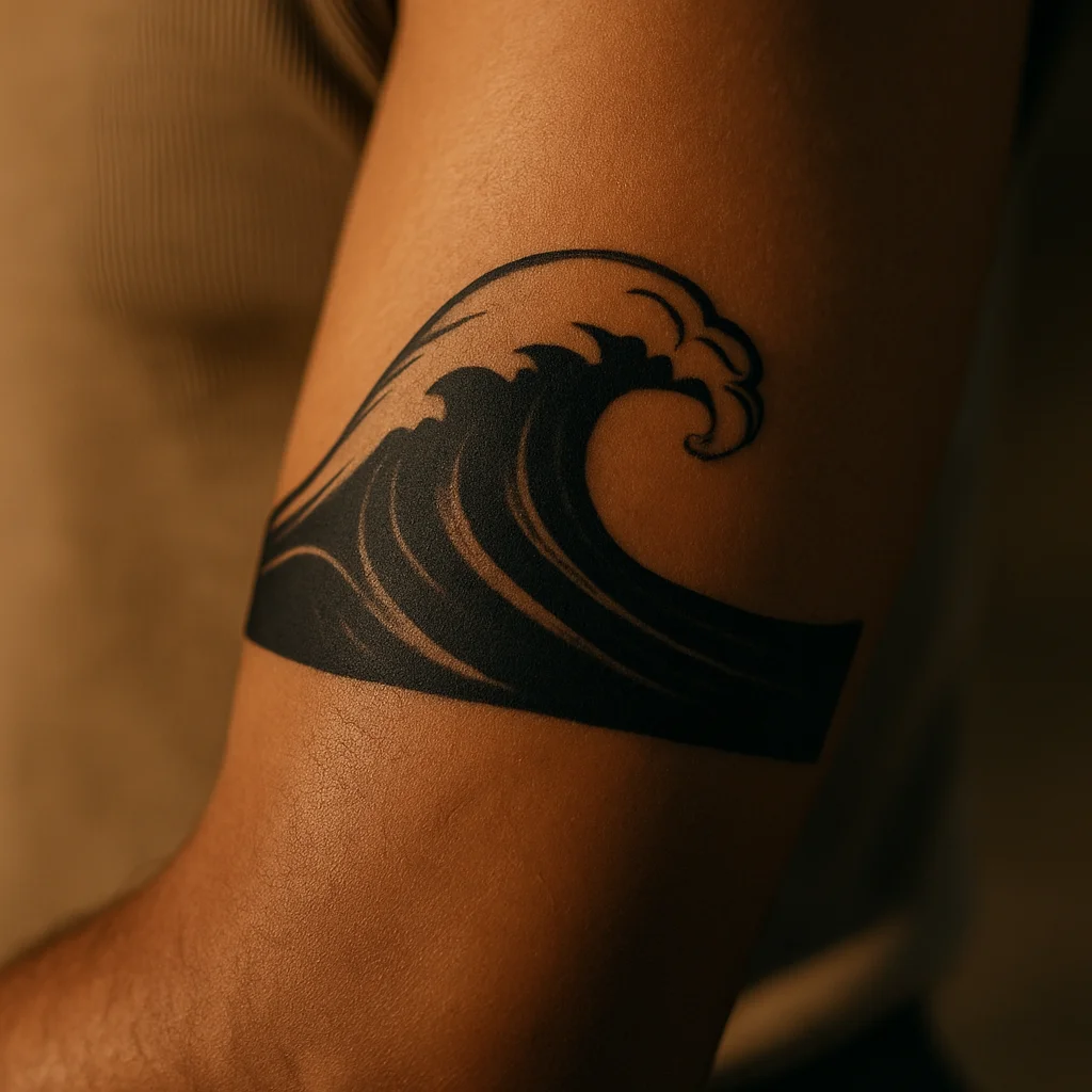
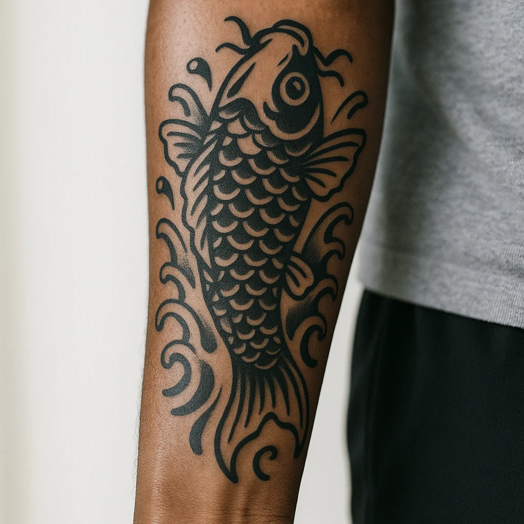
11. Wave crossing the panel
A single stylised wave with a curling crest, drawn wide rather than tall so it spans the arm. Solid black linework with a few white-skin gaps in the foam ages far better than dense grey wash. Sits well two or three inches below the elbow ditch.
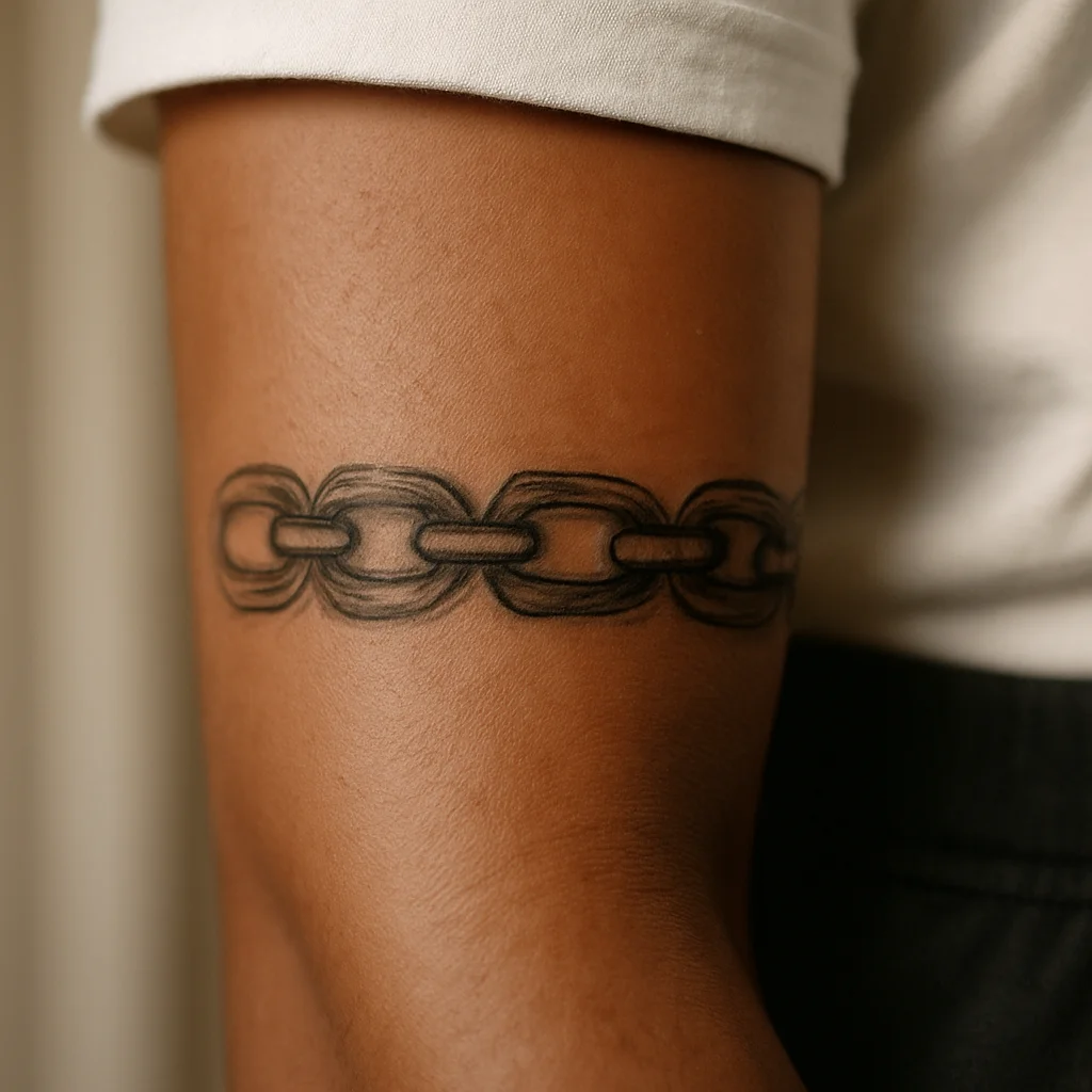
12. Chain-link bracelet band
A short run of chain links or a delicate cuff pattern crossing the upper inner forearm, just below the elbow. Because it reads as jewellery, it looks intentional even at a small size, and it's a good structural anchor if you plan to build downward later.
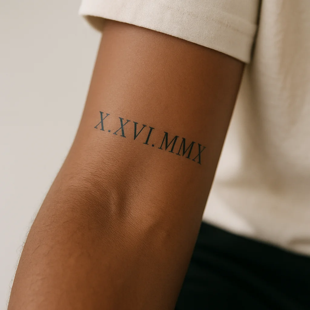
13. Roman numeral date
A date set across the arm in slim numerals with generous letter spacing. Horizontal placement is what keeps it from looking like a barcode running down your arm. Keep the numerals at least a few millimetres tall with clear gaps — cramped Roman numerals are one of the most common blowout regrets.
Wrist-anchored minis: small pieces near the crease
The bottom third of the inner forearm is prime real estate for small work: highly visible to you, easy to hide under a watch strap or cuff, and quick enough to be a lunch-break appointment. The only rule is clearance — sit the design above the wrist crease, not on it.
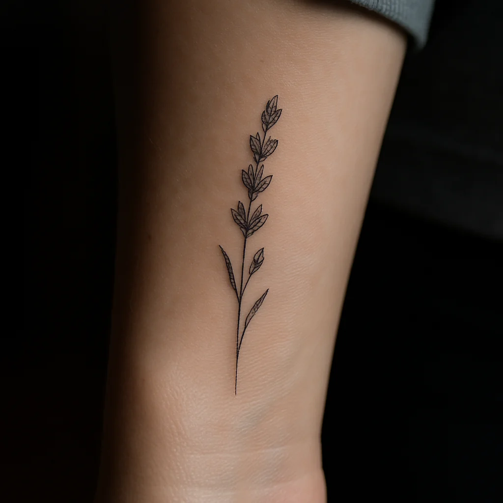
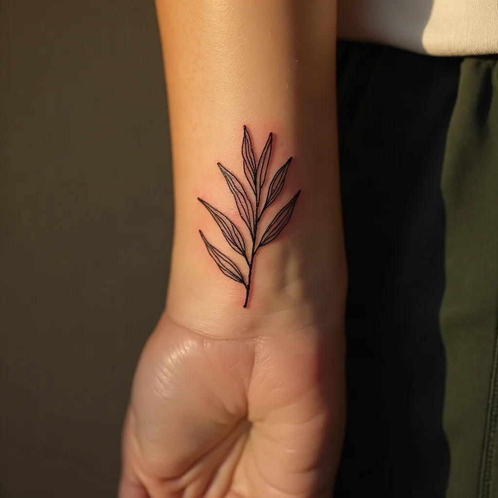
14. Lavender sprig
A single stem about two inches tall, tilted slightly rather than bolt upright. The tilt is what makes it look drawn rather than stamped. One of the best first tattoos going: fast, low pain, and it stays legible for decades because the buds are dots rather than lines.
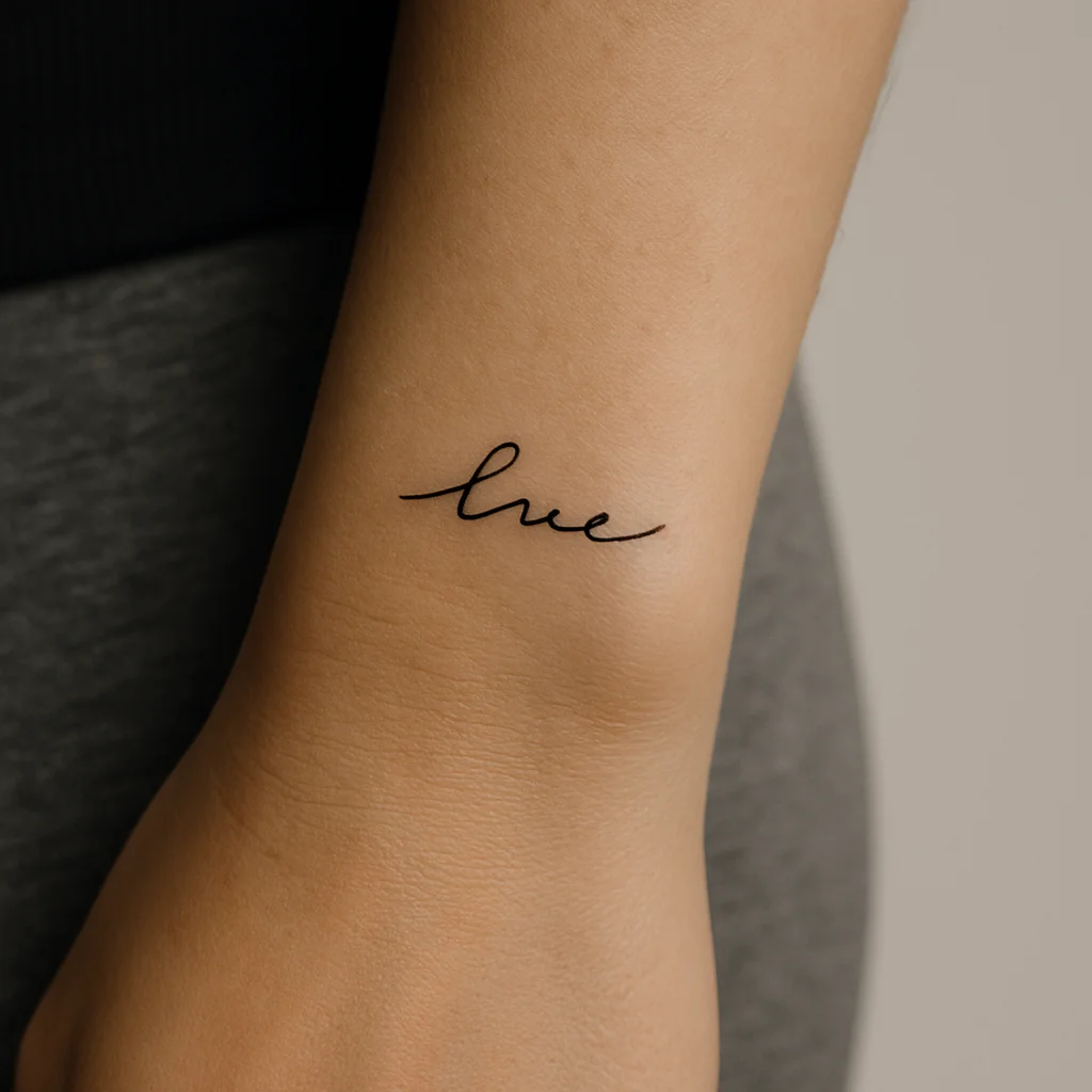
15. Micro-script word
One word in a small handwritten face — a name, a language you're learning, a word you keep coming back to. Placed just above the crease it's readable to you when you turn your palm up and invisible in a long sleeve. Keep it to a single line; two-line micro script tends to merge.
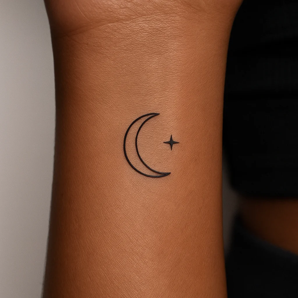
16. Crescent moon and star pair
A slim crescent with one small star set off to the side, no more than an inch and a half across. It suits narrow wrists where a bigger piece would wrap awkwardly. Solid fill on the crescent gives it presence at tiny scale.
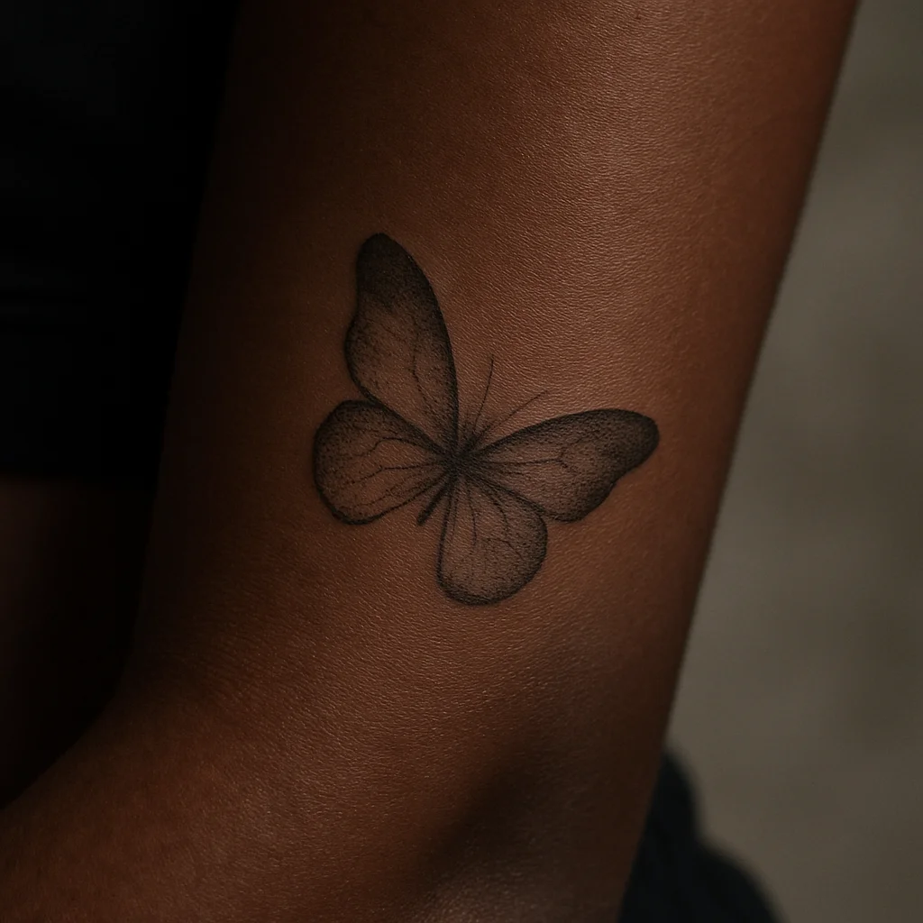
17. Soft-shaded butterfly
A small butterfly with the wings shaded in delicate stipple rather than outlined heavily, sitting a couple of inches above the crease. Angled diagonally, it looks like it landed there. Ask for slightly thicker outer wing lines than the interior detail so the silhouette survives ageing.
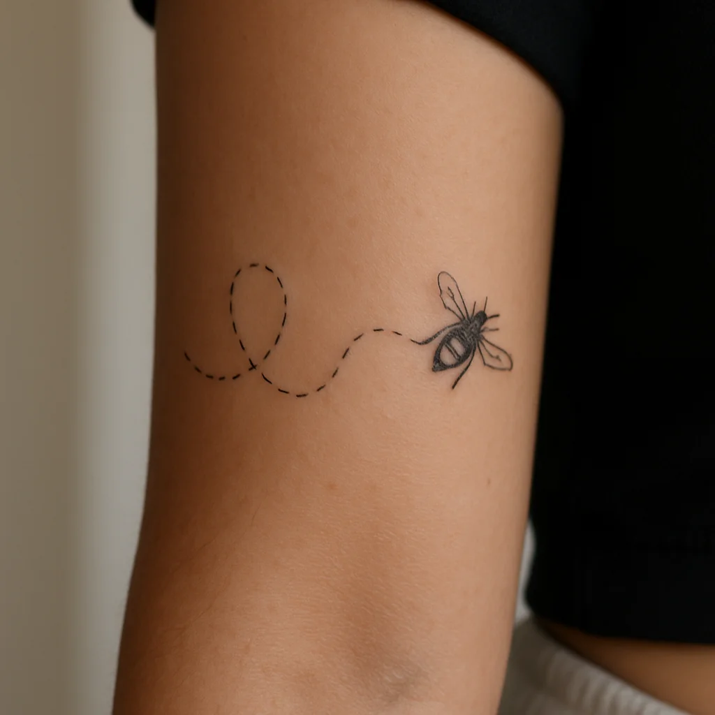
18. Bee with a dotted flight path
A tiny bee trailing a dashed loop behind it, the whole thing under two inches. It's playful without being cartoonish and the dotted line gives the piece movement in an otherwise still area. Works especially well slightly off-centre, toward the thumb side.
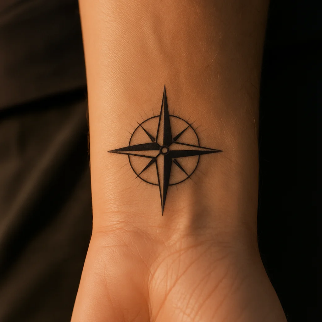
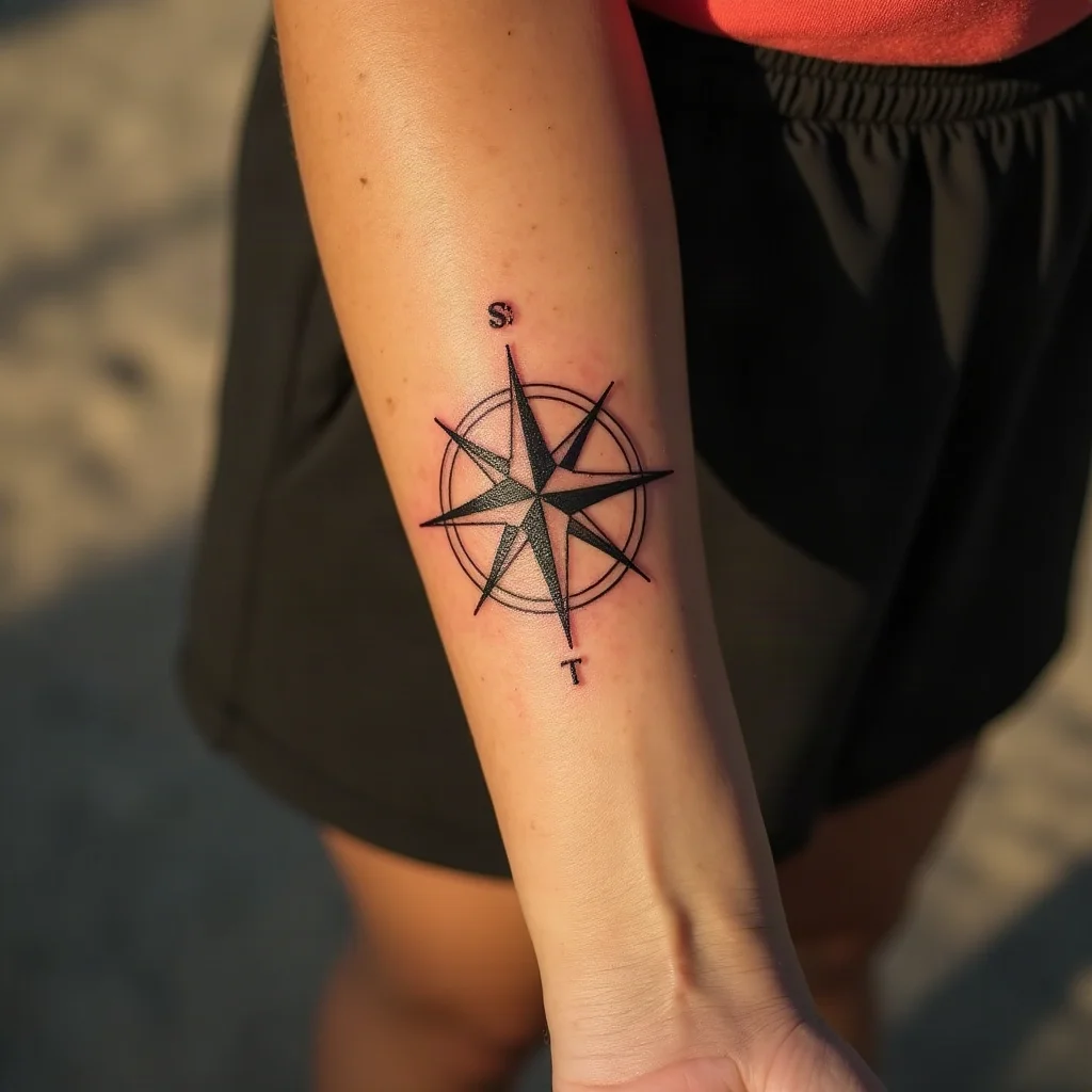
19. Coin-sized compass rose
A simple four-point compass with fine hairlines between the cardinal directions. Keep the interior spare — compasses fail small when artists cram in degree markings. On the inner forearm it sits like a small emblem rather than a nautical scene.
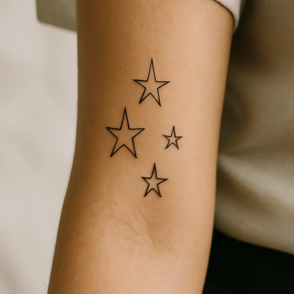
20. Scattered star cluster
Three or four stars of different sizes placed asymmetrically over a couple of inches, as if sprinkled. The uneven spacing is what stops it looking like clip art, and you can add stars over the years. Very low pain and one of the cheapest pieces you'll ever sit for.
Full-panel statements: filling the whole inside of the arm
If you want the inner forearm to carry a real piece rather than an accent, treat the whole panel as one composition from a few centimetres below the elbow to a few above the wrist. Budget two to four hours and expect to build it in one or two sessions. These are the designs that justify the space.
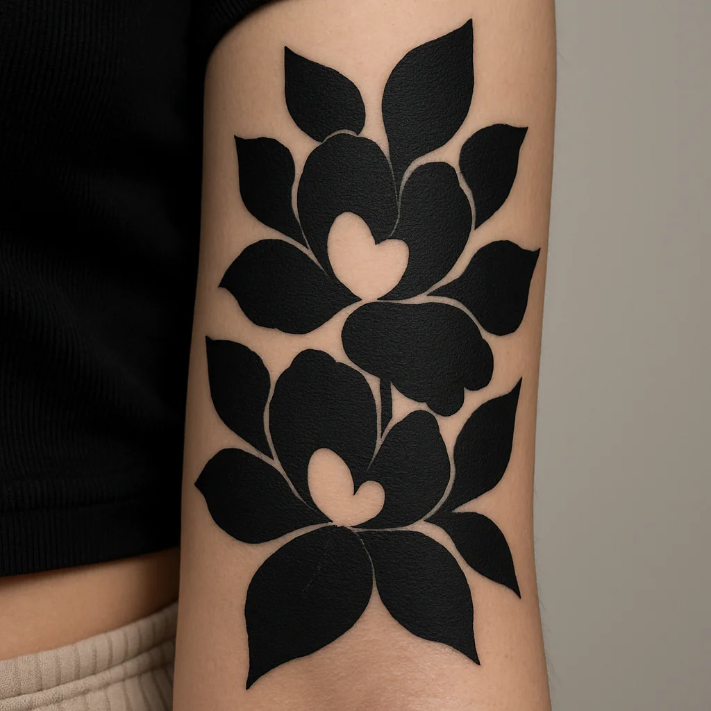
21. Blackwork floral panel with negative space
Heavy black petals and leaves arranged so the bare skin between them forms its own shapes. Because the contrast is extreme, it stays readable across the room and ages better than any grey wash. Best on someone who wants boldness but not colour.
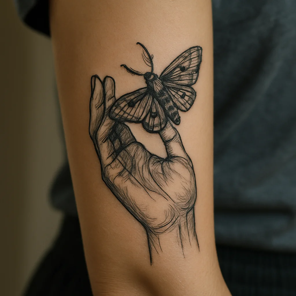
22. Hand holding a moth
An illustrative hand, palm open, with a moth resting on the fingertips, running the length of the panel. The vertical hand shape fits the narrow space almost perfectly, and the moth's wing detail gives the artist somewhere to show off. Expect the fine antennae to soften over time — that's fine.
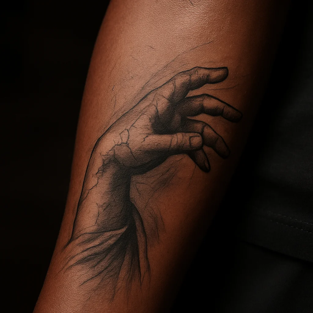
23. Statue hand reaching
A fragment of classical sculpture — cracked marble fingers, a wrist, a hint of drapery — rendered in soft black and grey. On the inner forearm the fragment reads as intimate rather than monumental. Ask for a clear light source; statue work with confused shading turns muddy fast.
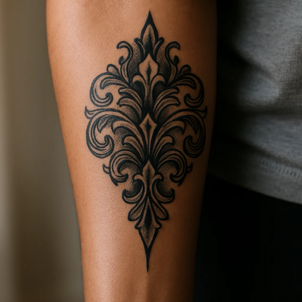
24. Ornamental filigree half-panel
Symmetrical scrollwork with dotwork shading and a small gem or crescent at the centre, filling the upper two-thirds of the panel and tapering toward the wrist. It borrows from jewellery and lace and it flatters slim arms because the taper follows the limb. Consider mirroring a smaller version on the other arm.
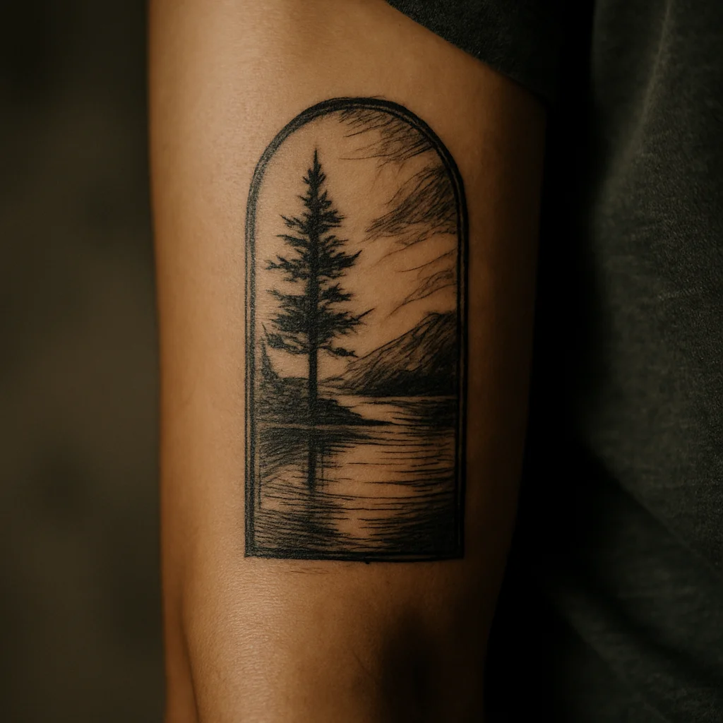
25. Arched window landscape
A tall arched frame with a scene inside — pines and a lake, a moon over dunes, a single distant house. The frame does the heavy lifting: it contains the detail and keeps the piece from bleeding into bare skin. Keep the inner scene simple, because a busy micro-landscape closes up within a few years.
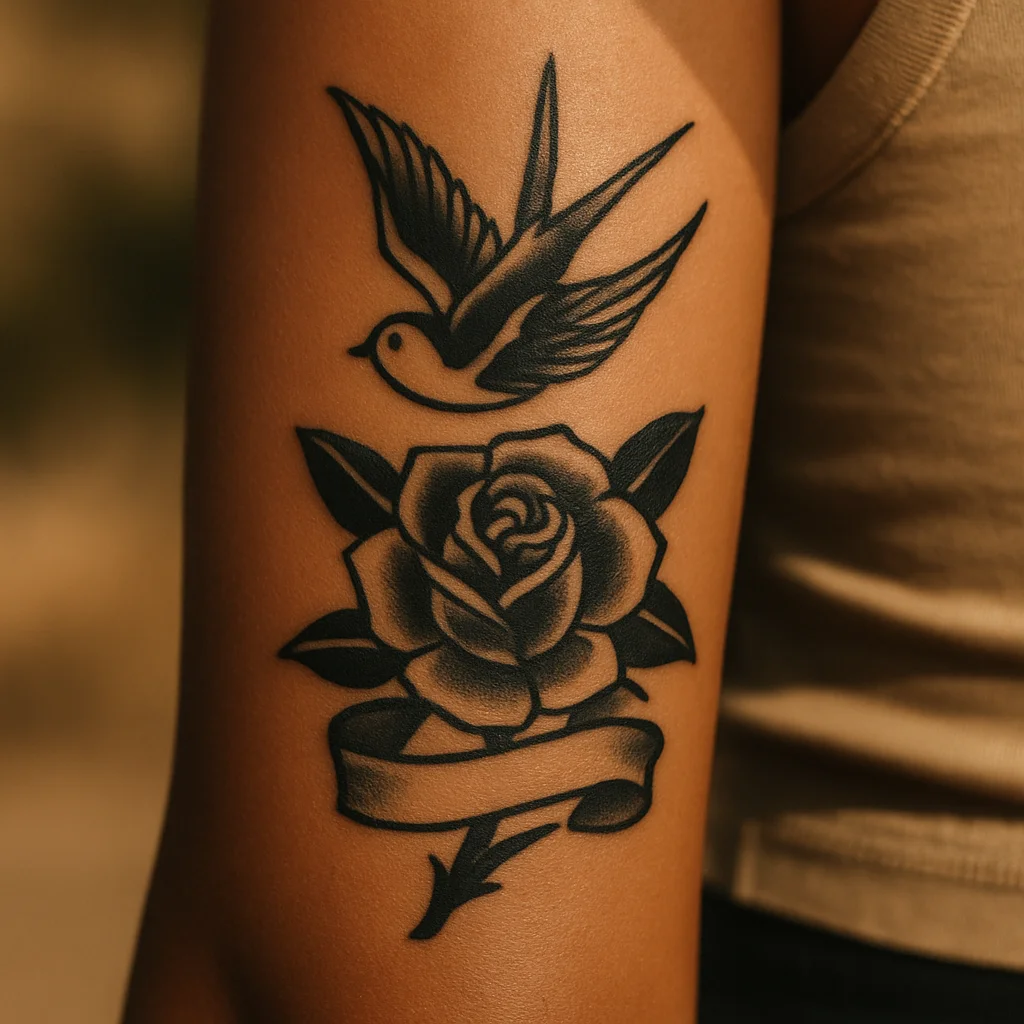
26. Traditional rose and swallow
An old-school rose with a swallow above it and a small banner, in bold black outline with red and green packed solid. It's the loudest option here and the one most likely to look exactly the same in twenty years. Traditional work needs breathing room, so let it own the whole panel rather than squeezing it into a corner.
Pain, sitting time and what it costs
The inner forearm is where a lot of people get tattooed second, and for good reason: it hurts less than ribs, spine or the top of the foot, and the sitting position is comfortable. Most describe the mid-panel as a hot scratch that becomes background noise after fifteen minutes. Two zones break that pattern. The elbow ditch is thin, nervy and unavoidable if your design runs the full length, and the last inch above the wrist crease can make people flinch, especially over the tendons.
Time: a small wrist-anchored mini is often 20 to 45 minutes including setup. A vertical botanical column typically runs one and a half to three hours. A full-panel illustrative or blackwork piece is a half-day, sometimes split across two visits if shading is heavy.
Cost: most studios charge a shop minimum for anything tiny — a coin-sized star cluster or single word usually lands at that minimum regardless of how fast it goes. Beyond that you're paying by the hour or a flat quote, and hourly rates vary enormously with city and artist reputation. As a rough shape: expect a small piece to sit near the minimum, a mid-size column to cost the equivalent of two to three hours, and a full-panel custom piece to reach the low four figures with a sought-after artist in a major city. Custom drawing time and deposits are normal; a studio that quotes a full-panel piece over text without seeing your arm is a red flag. For a wider picture of what shapes those numbers, our breakdown of real tattoo costs is worth a read before you book.
Briefing your artist and healing the panel
Bring three things to a consultation: a rough size in centimetres, a direction (vertical, crosswise or anchored low), and two or three references that show the weight of line you like, not just the subject. Artists can draw a rose in a hundred ways — what they need from you is whether you want hairline delicacy or something bold enough to still read from a metre away in fifteen years.
Ask specifically about flex clearance. A good artist will already be planning to keep the design out of the elbow crease and off the wrist fold, but say it out loud so you both agree where the piece stops. Also ask them to stencil it and let you stand up, let your arm hang naturally, and look in the mirror before they start — a vertical design that looked centred while you were lying on the bed can sit noticeably off-axis when your arm relaxes.
Healing: the inner forearm is easy to care for and easy to knock. Keep it washed twice a day with unscented soap, use a thin layer of a light moisturiser, and resist the urge to over-cream — the inner arm holds moisture well and soggy healing is a real risk here. The bigger hazards are sleeves catching on the fresh piece and gym bars or steering wheels rubbing it. Give it a week of loose clothing and no dumbbells, then two to three weeks of sunscreen discipline once it's sealed. For the full timeline, see our guide to the first 30 days of aftercare.
Frequently asked questions
Does an inner forearm tattoo hurt more than the outer forearm?
Slightly, yes. The skin is thinner and there's less muscle padding, so the sensation is sharper, particularly in the last inch before the wrist and in the elbow ditch. Most people still rate the mid-panel as one of the more manageable spots on the body, well below ribs or spine.
Do inner forearm tattoos fade quickly?
They tend to fade slower than most placements because the inside of the arm gets far less sun than the outside. The bigger risk is line softening rather than colour loss, and it happens where the skin flexes — right on the wrist crease or in the elbow bend. Keeping a finger's width of clearance at each end and using sunscreen in summer covers most of it.
How big should an inner forearm tattoo be?
Most inner forearms give you roughly a hand's length of usable height and three to four fingers of width. That means vertical designs can comfortably run six to eight inches, while crosswise designs need to stay under about three and a half inches wide or they wrap out of sight. Anything under two inches works best anchored near the wrist.
Can I hide an inner forearm tattoo at work?
Easily, with any long sleeve. Because the panel faces inward, even a rolled three-quarter sleeve conceals a lot of it, and a watch or cuff covers a wrist-anchored mini entirely. It's one of the most job-flexible visible placements you can choose.
Should I get one big piece or build up smaller tattoos?
Both work, but they need different planning. If you might add more later, ask your artist to place the first piece with deliberate gaps and a consistent line weight so future work can connect to it. Scattered tattoos added at random over years are the main reason people end up needing a cover-up or a unifying background.
The conversation
No comments yet. Got a thought about these designs? Start us off.
Want to weigh in? Join the community to comment, save designs and try them on your skin.