30 Tattoo Ideas You Can Actually Take to an Artist
A working list of thirty tattoo ideas with enough detail to actually take to an artist, plus the questions that turn a vague urge into a design you'll still like in fifteen years.
Start With a Feeling, Not a Feed
Most people arrive at a studio with a folder of screenshots and no idea what connects them. Artists notice this instantly, and it's why so many consults stall. The fastest way out is to stop searching for a picture and start naming a feeling, a place, or an object you already care about.
Try this on paper before you look at a single reference. Write three columns:
- Objects — physical things with weight in your life: a set of keys, a cast-iron pan, a ferry ticket, your father's watch, the wildflower that grows in the ditch by your childhood house.
- Places — a coastline, a specific mountain profile, a city grid, the shape of a lake you swam in every July.
- Verbs — what you want the tattoo to do: steady me, remind me, mark the end of something, make me laugh.
Now draw a line between one object and one verb. "Sewing needle" plus "mark the end of something" becomes a needle and thread stitching along an old scar. "Ferry ticket" plus "remind me" becomes a tiny hand-drawn stub with a real date punched into it. That collision is the idea. The style, size and placement are decisions you make afterward, and they're much easier once the concept is fixed.
One warning from every artist who has ever worked a busy Saturday: a screenshot of another person's finished tattoo is a bad brief. It tells your artist what someone else's client wanted. Reference photos of the actual subject — the real moth, the real teacup, your grandmother's handwriting — give them something to design with.
What follows are 30 ideas written as briefs, not as single words. Each one can be scaled up, simplified, or moved, and every one of them has been done well by someone; the specificity is what keeps it from looking generic.
Botanical and Landscape: 6 Ideas
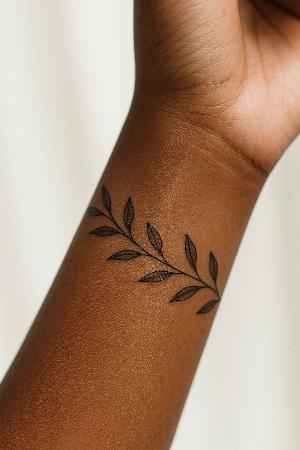
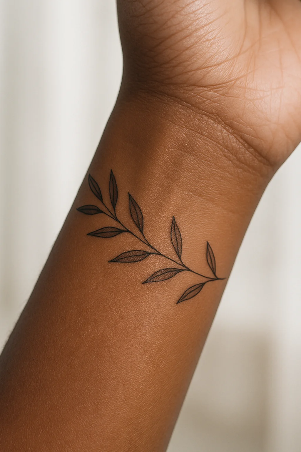
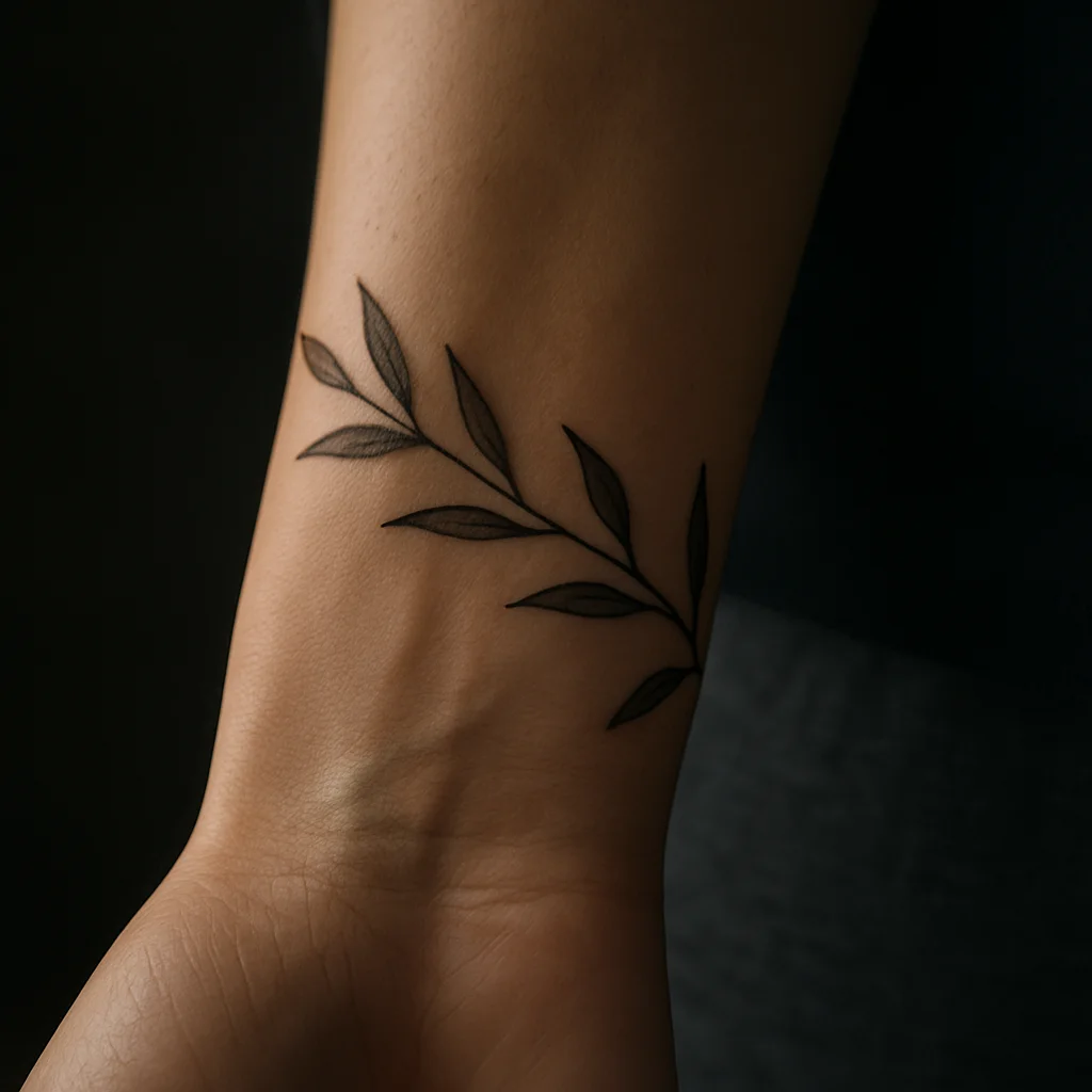
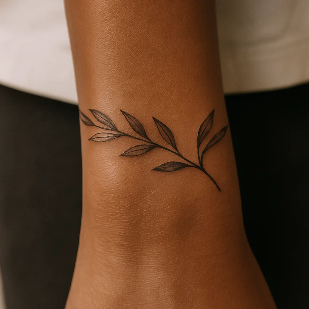
1. Olive branch that wraps the wrist
Leaves alternate around the curve so the branch appears to pass behind the arm. Leave the ends open rather than meeting in a closed bracelet — it reads as a plant, not a cuff.
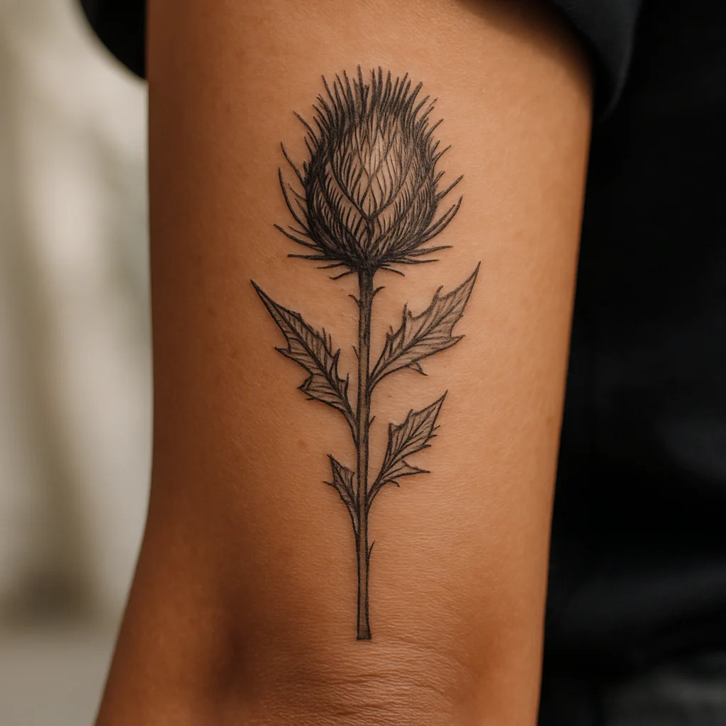
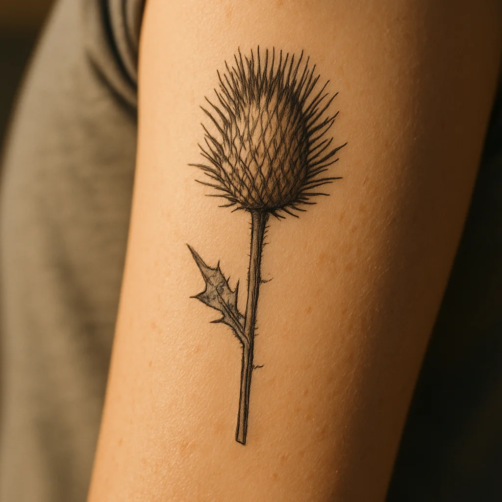
2. A single dried thistle
Draw it as a botanical plate specimen, with the stem cut flat at the bottom as though it had been mounted. Fine hatching in the bract gives the head its texture without turning into shading soup.
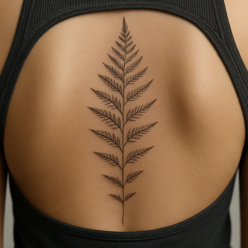
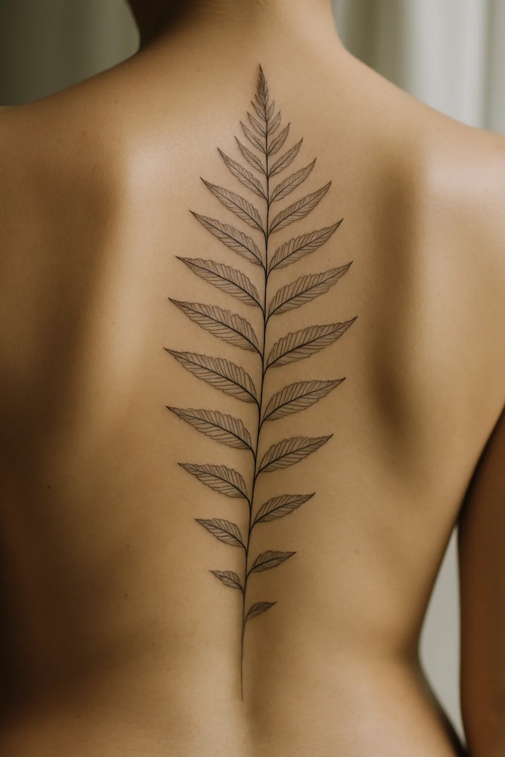
3. Fern frond running down the spine
Pinnae get smaller as the frond descends, and the whole thing follows the vertebrae rather than sitting arrow-straight. Letting it curve with the bone is what makes it look grown rather than stamped on.
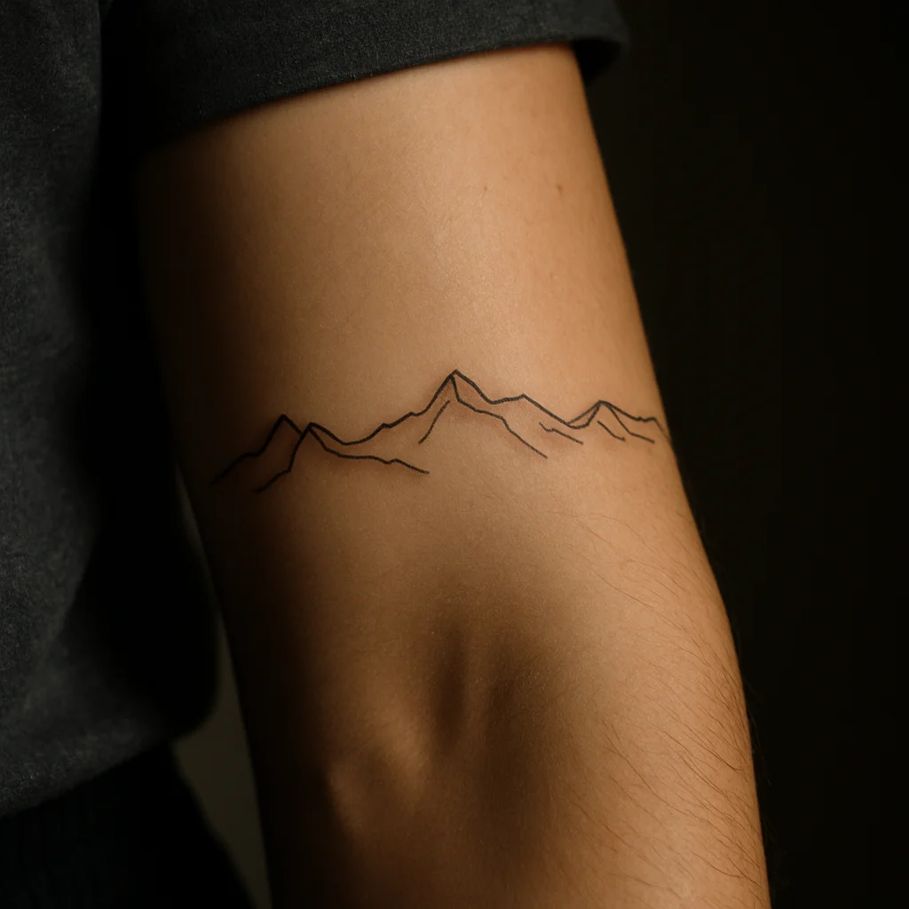
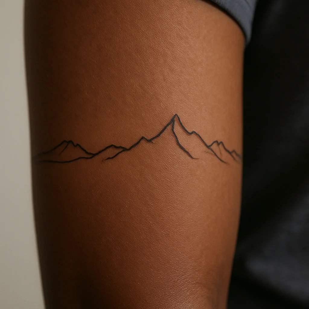
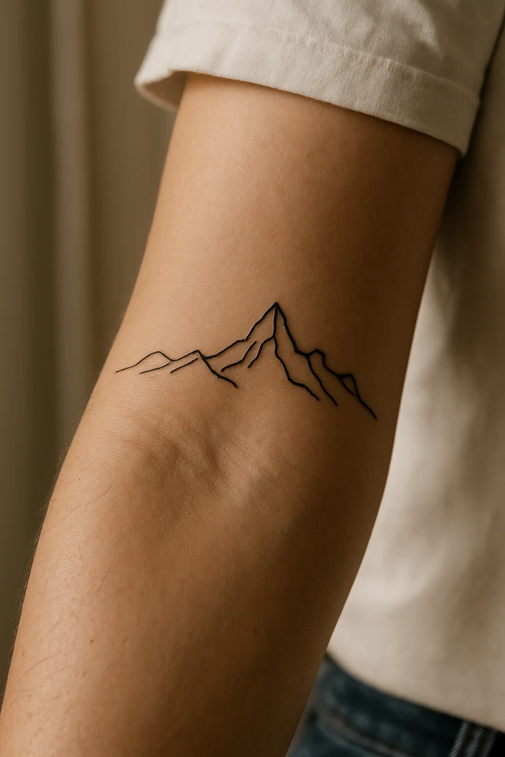
4. Mountain ridge in one continuous line
Use a real skyline you can name, drawn without lifting the pen. No sun, no frame, no circle around it — the profile is the whole point.
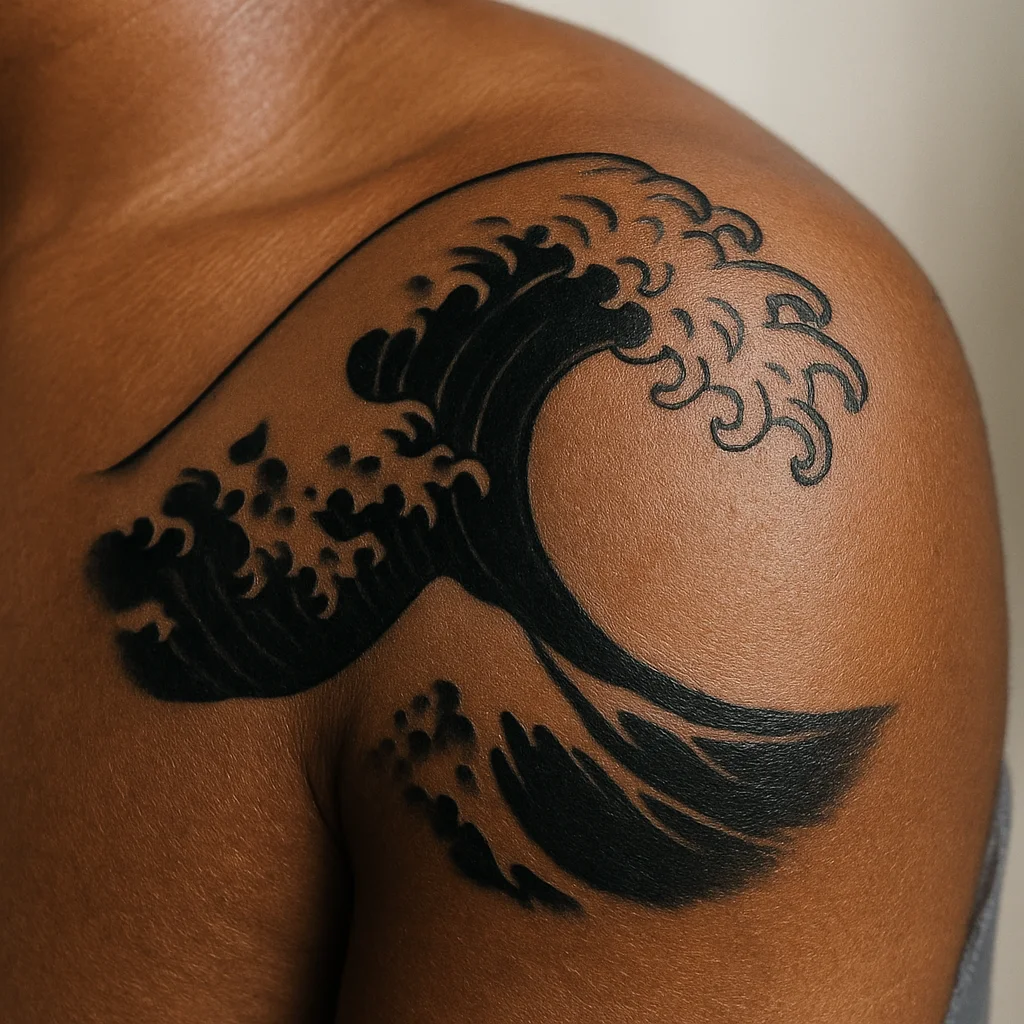
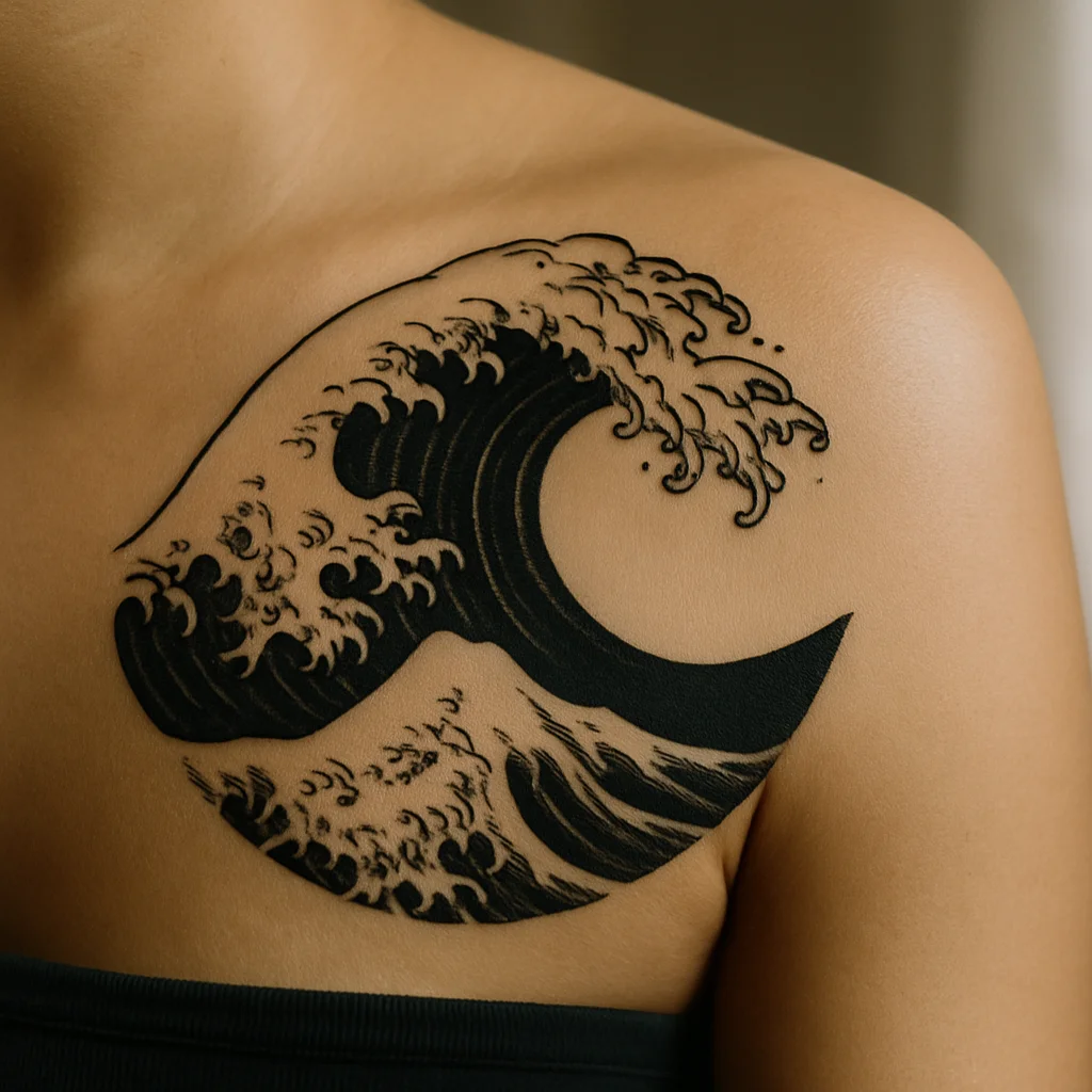
5. Ocean wave in Japanese-inspired blackwork
Let it curl with fingers of spray and keep the trough solid black for contrast. It's a design that stays legible at almost any size.
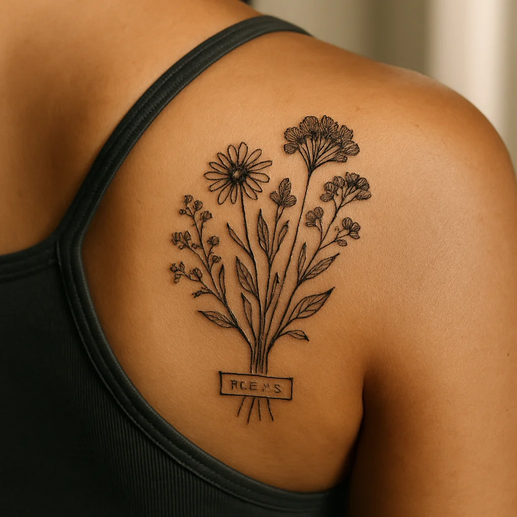
6. Pressed wildflower cluster
Arrange the stems like a herbarium page, with a tiny hand-lettered species label underneath. The label is what turns a bunch of flowers into a specific memory.
Animals: 5 Ideas
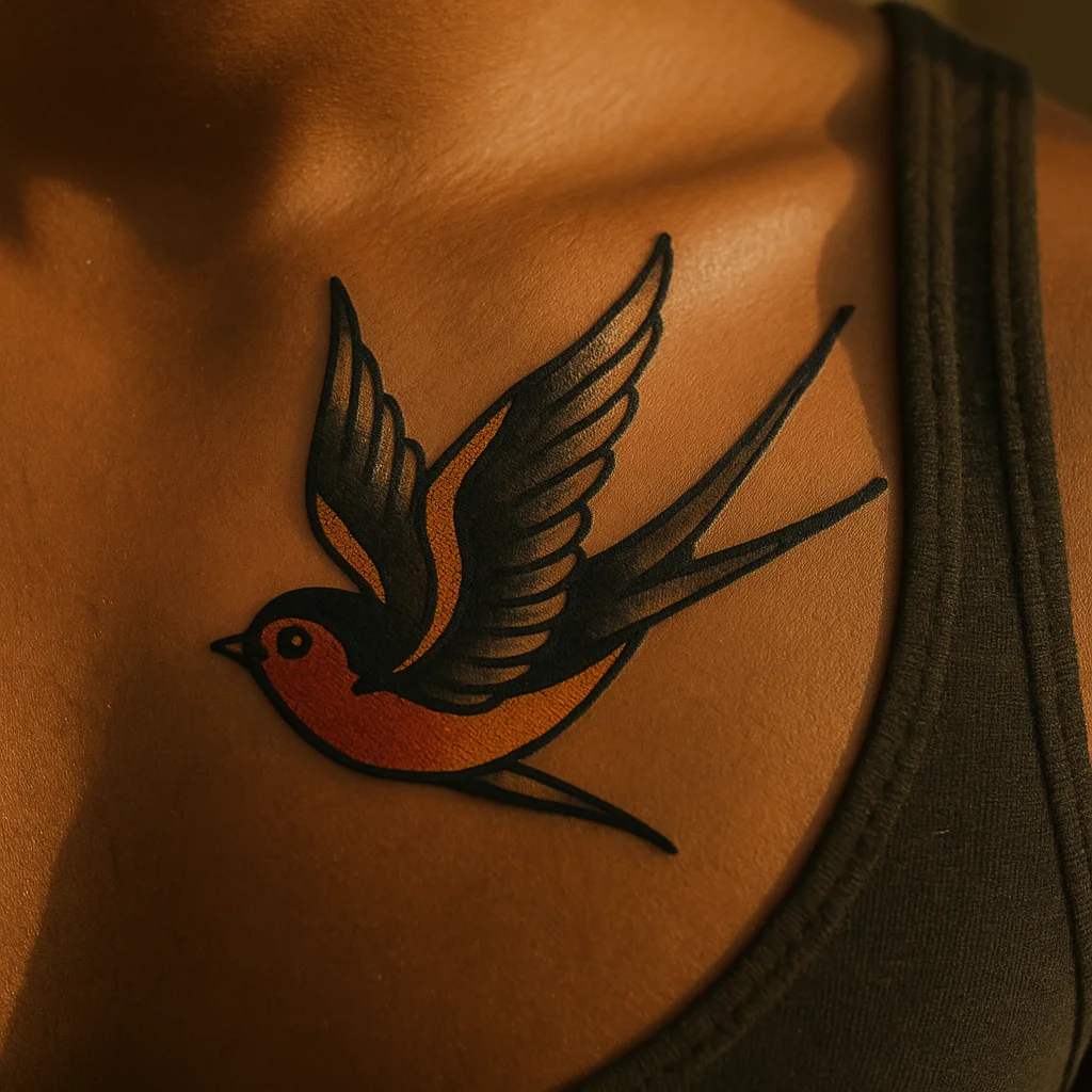
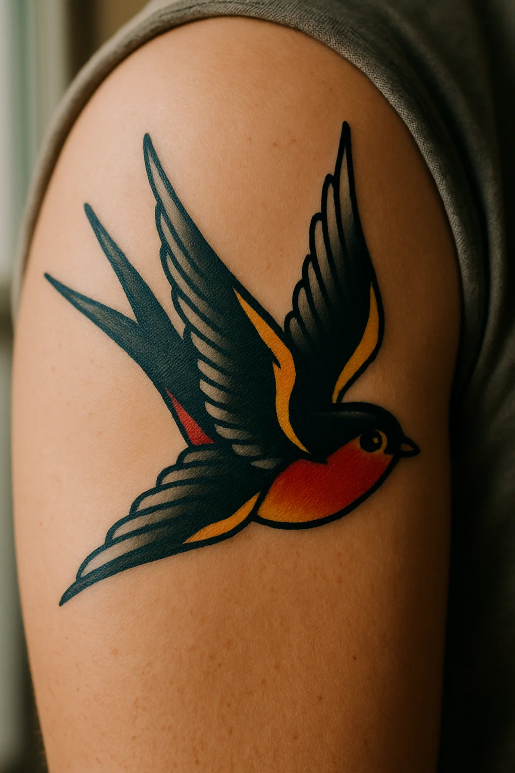
7. Traditional swallow mid-flight
Wings swept back, bold outline, two-colour breast. This is the classic that survives decades of skin change, which is exactly why it keeps getting tattooed.
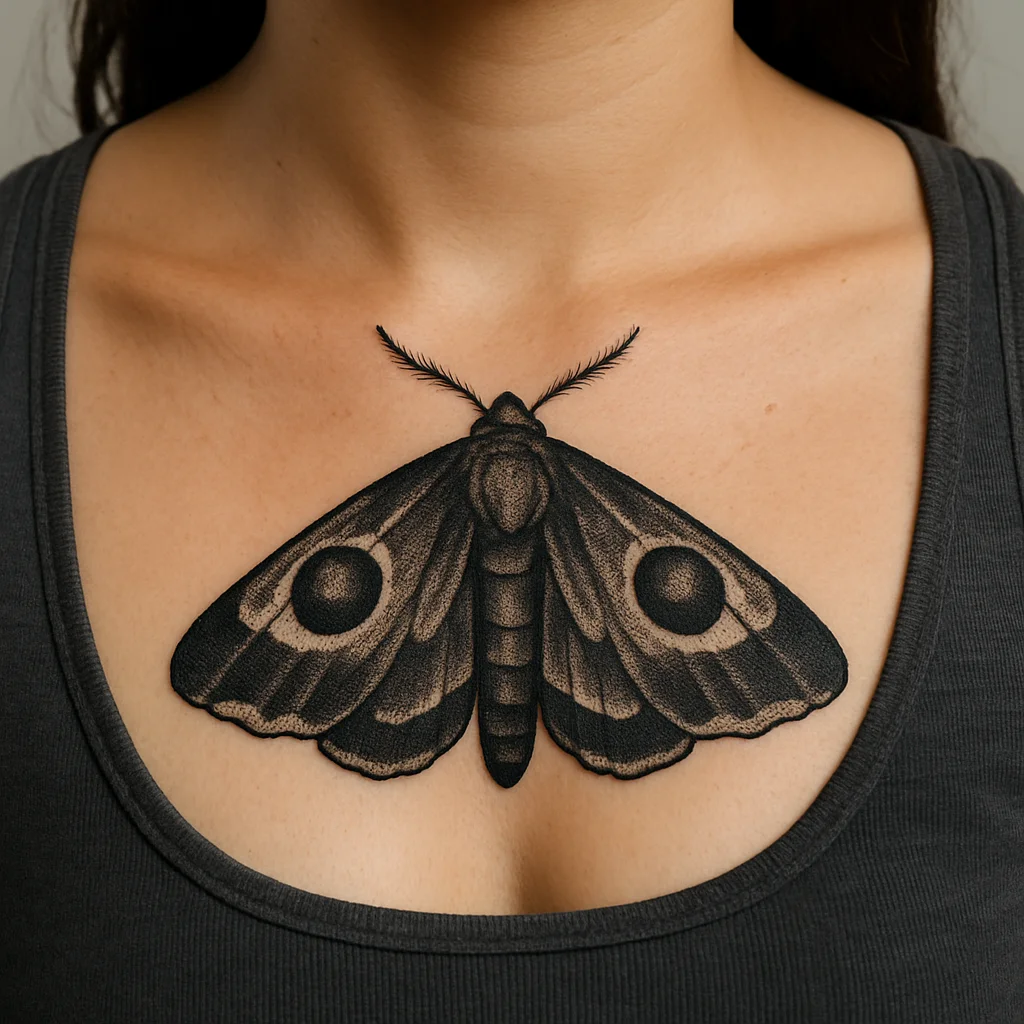
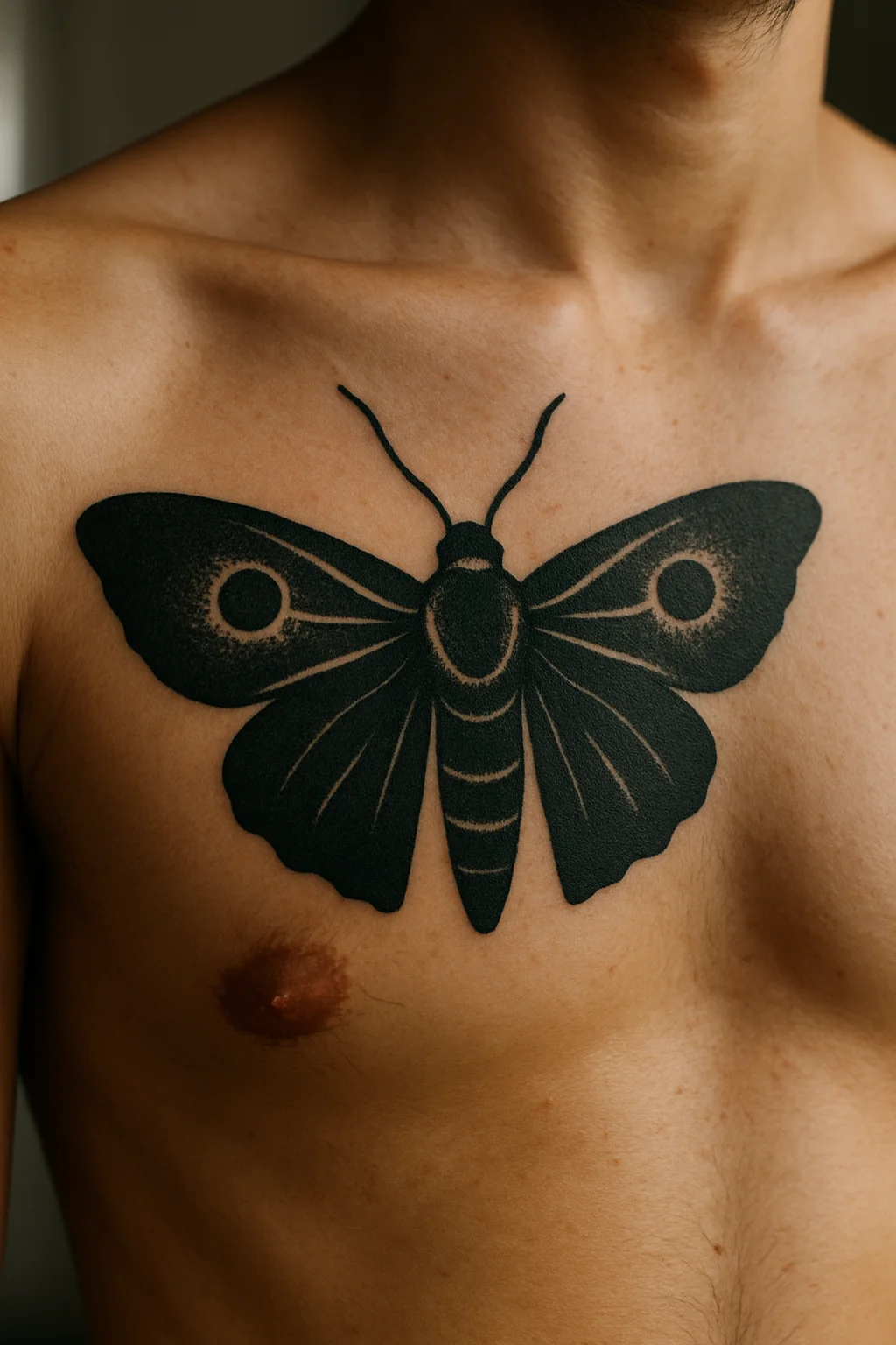
8. Moth with folded wings on the sternum
Keep it symmetrical and let the centre line of the body sit on the centre line of the chest. Render the eye-spots in dense stipple rather than smooth grey.
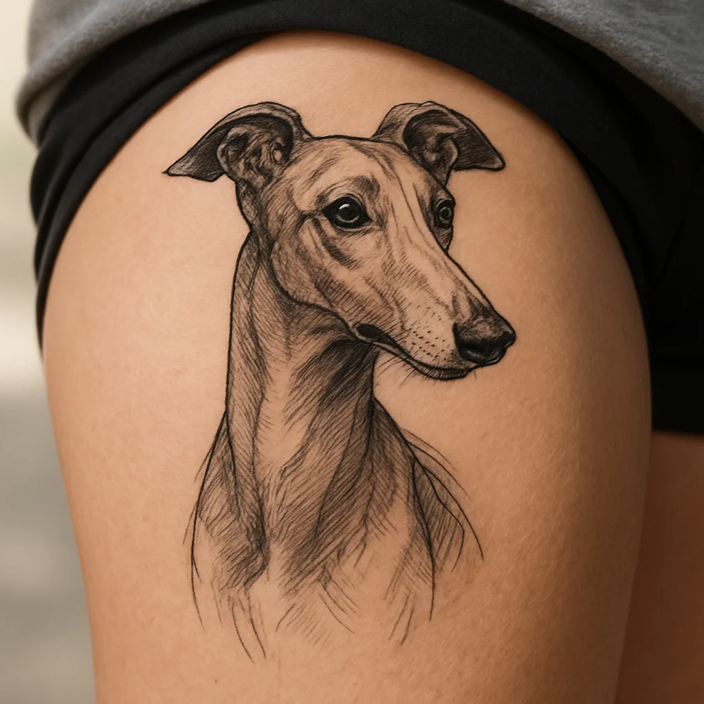
9. Illustrative greyhound portrait
On the thigh, with a three-quarter head turn so you get some structure in the skull. A soft grey wash in the chest fur keeps it from going flat.
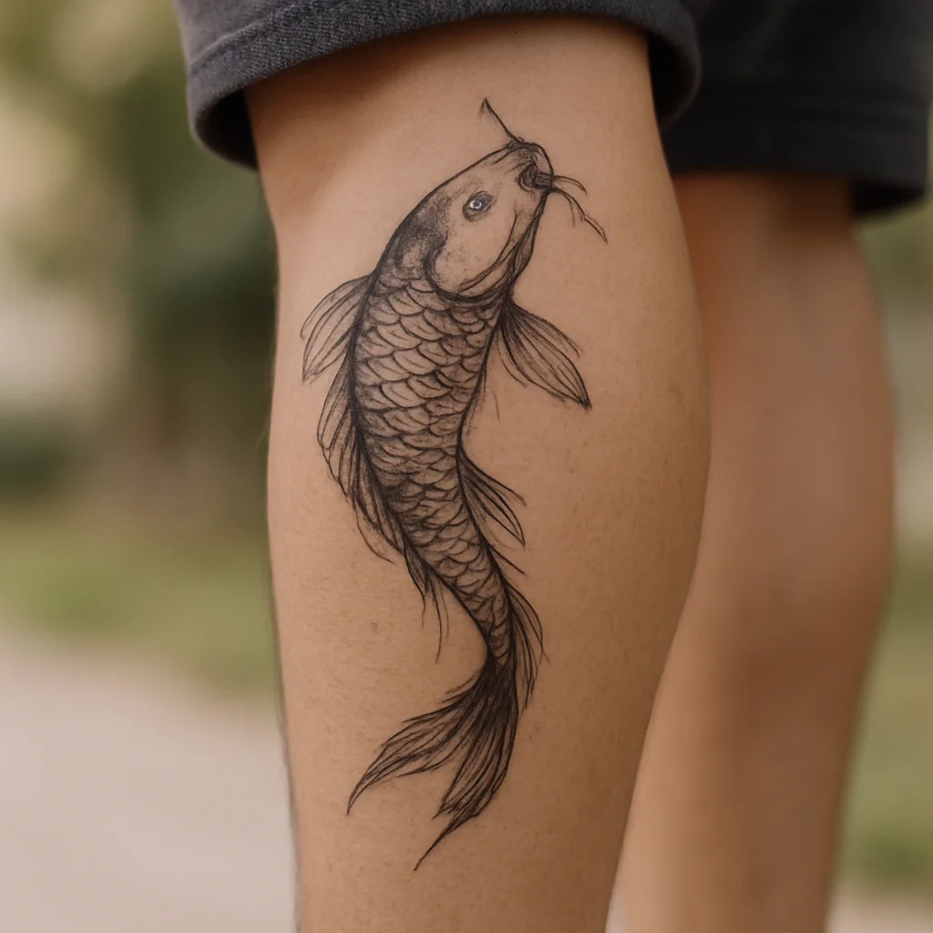
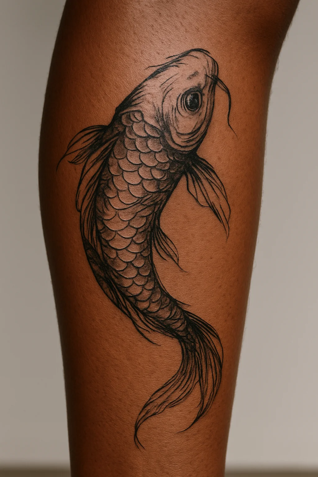
10. Koi curving around the calf
The body follows the muscle so the fish looks like it's swimming up the leg. Placement is doing half the composition work here.
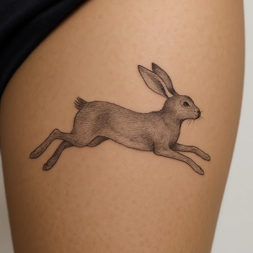
11. Hare mid-leap in fine line
Back legs still extended, ears flat, no ground line so it floats on the skin. The absence of scenery is what keeps it light.
Objects That Carry a Story: 6 Ideas
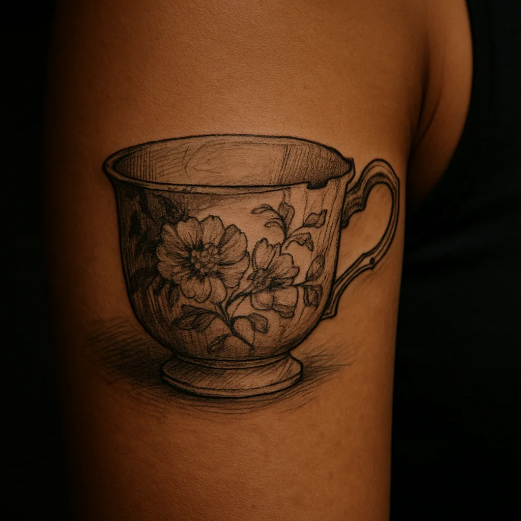
12. Your grandmother's teacup
Drawn from a photograph, pattern included, slightly chipped if it was chipped. The flaw is the part that makes it hers.
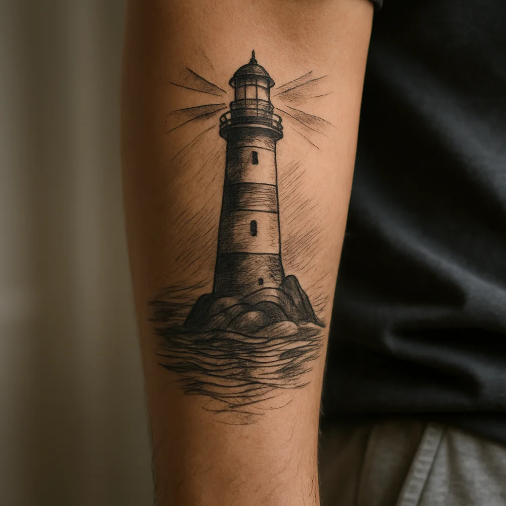
13. Lighthouse seen from the water
Take the viewpoint of a boat rather than a postcard. Suggest the beam with a few tapered rays instead of a full glow, which never ages well.
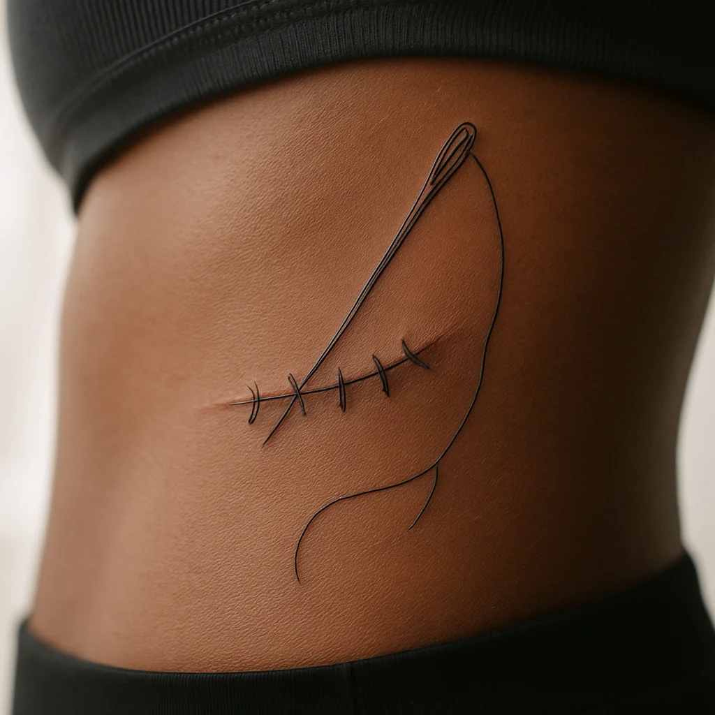
14. Needle and thread stitching over a scar
Follow the line you already have and let the thread trail loose at the end. It marks the end of something without spelling it out.
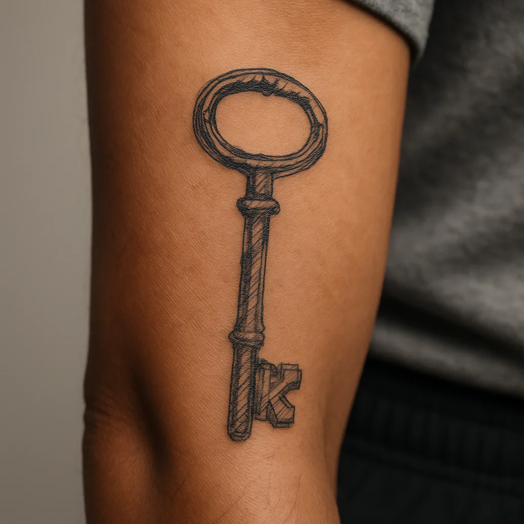
15. Hand-drawn key
Base it on a real key you've owned, warts and worn teeth intact. A perfect generic key looks like clip art; a specific one looks like a life.
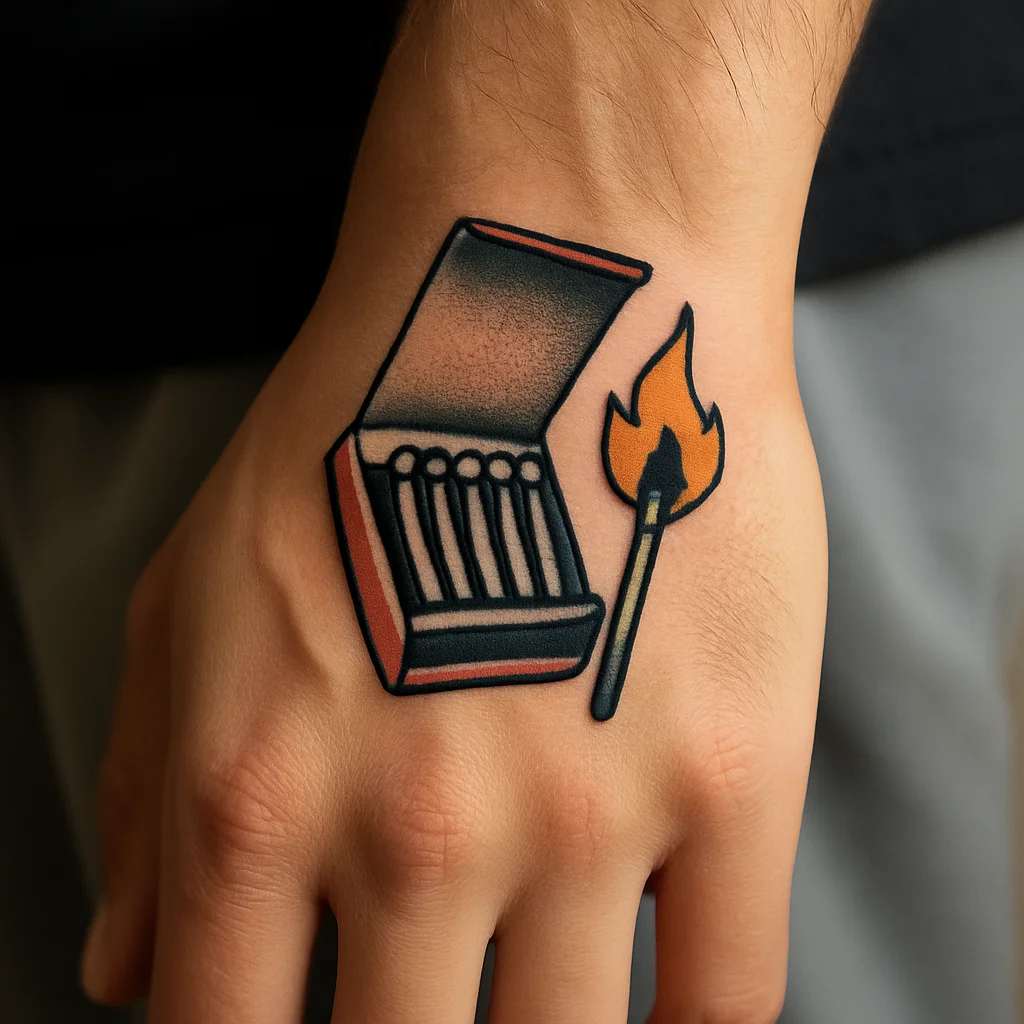
16. Vintage matchbook
Cover open, one match struck. Excellent in traditional colour with a mustard-yellow flame, which holds far better than pale yellows.
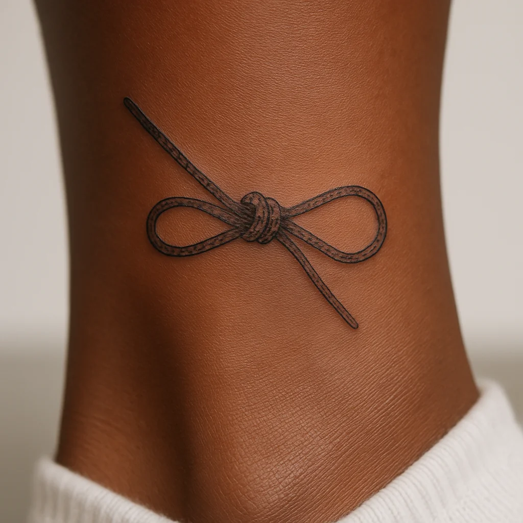
17. Knotted bootlace
A tight fine-line loop, taken from boots you actually wore out. Small, quiet, and it means nothing to anyone else.
Symbols and Marks: 5 Ideas
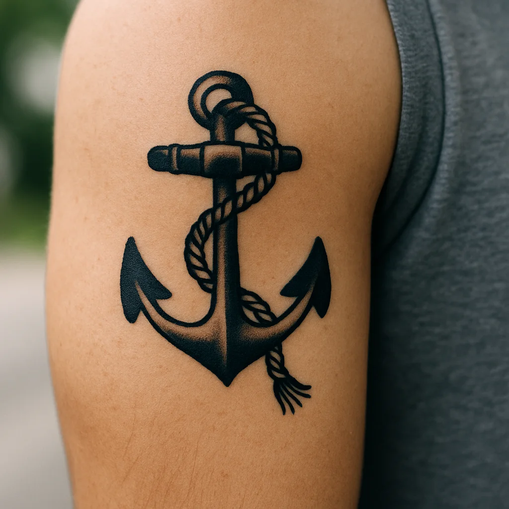
18. Anchor with rope
Wrap the rope twice around the shank and end it frayed rather than neatly cropped. Bold outlines here will still read across a room in thirty years.
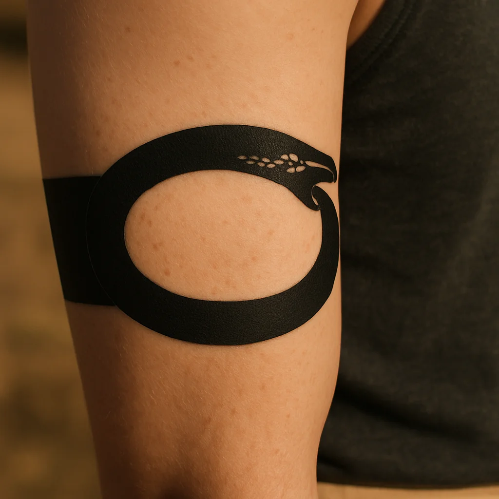
19. Ouroboros as a thin band
Run it around the upper arm and put the join — head meeting tail — on the inside where only you see it. A band with a secret in it beats a band without one.
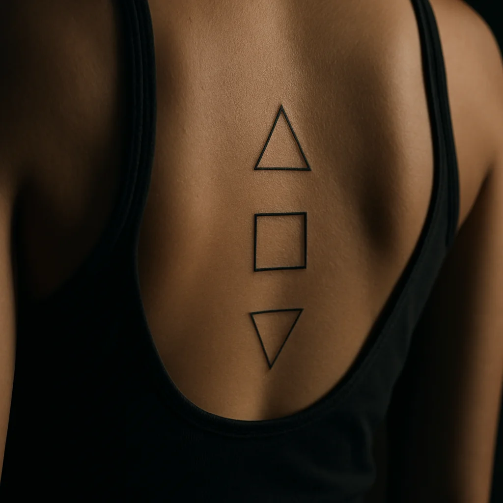
20. Three small alchemical glyphs
Earth, salt and fire in a vertical stack, spaced generously so they read as deliberate marks rather than clutter. The gaps are as important as the glyphs.
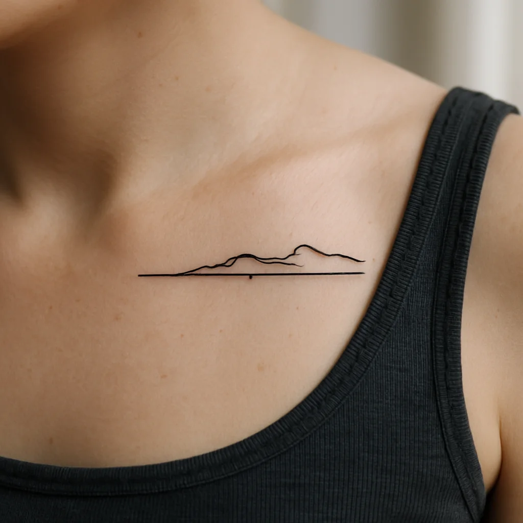
21. Coastline drawn as coordinates
A short segment of shoreline sitting above a numeric line, both in the same weight so neither dominates. It works well along the collarbone.
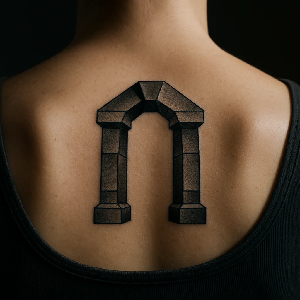
22. Geometric arch or gateway
Two uprights and a keystone, referencing a threshold you actually crossed. Symmetrical, so it wants a centre line like the upper back.
Lettering: 4 Ideas
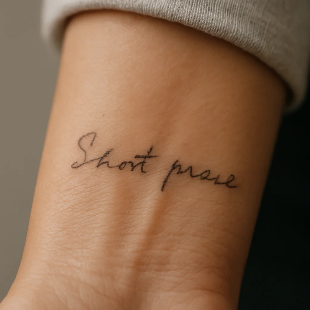
23. Phrase in someone's real handwriting
Scan it from a letter or card, keep it small, and leave it slightly imperfect. Cleaning up the wobble removes the only thing that makes it theirs.
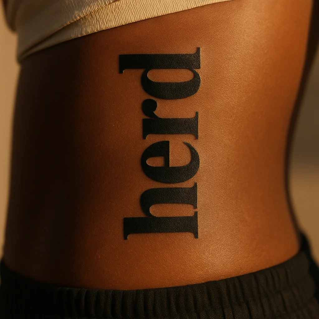
24. One word in a heavy serif
Set it vertically along the ribcage with the letterspacing opened up, so it stays legible as skin softens. Tight letterspacing is what turns lettering into a smudge.
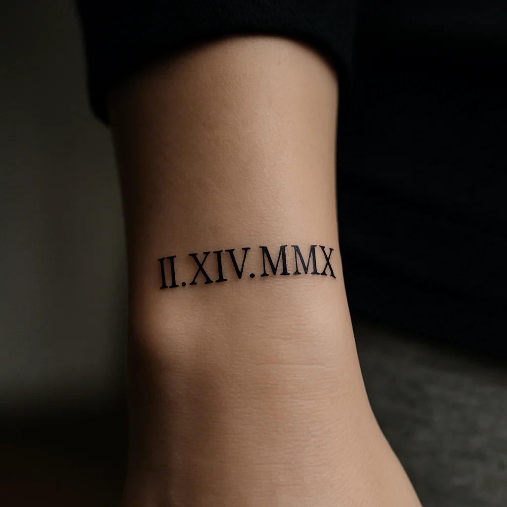
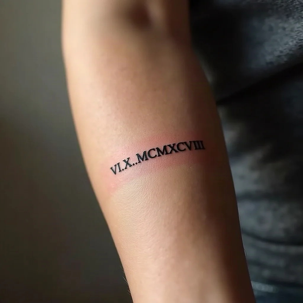
25. Roman numeral on the side of the wrist
Thin slab serifs, no flourish, no underline. A date reduced to its bones.
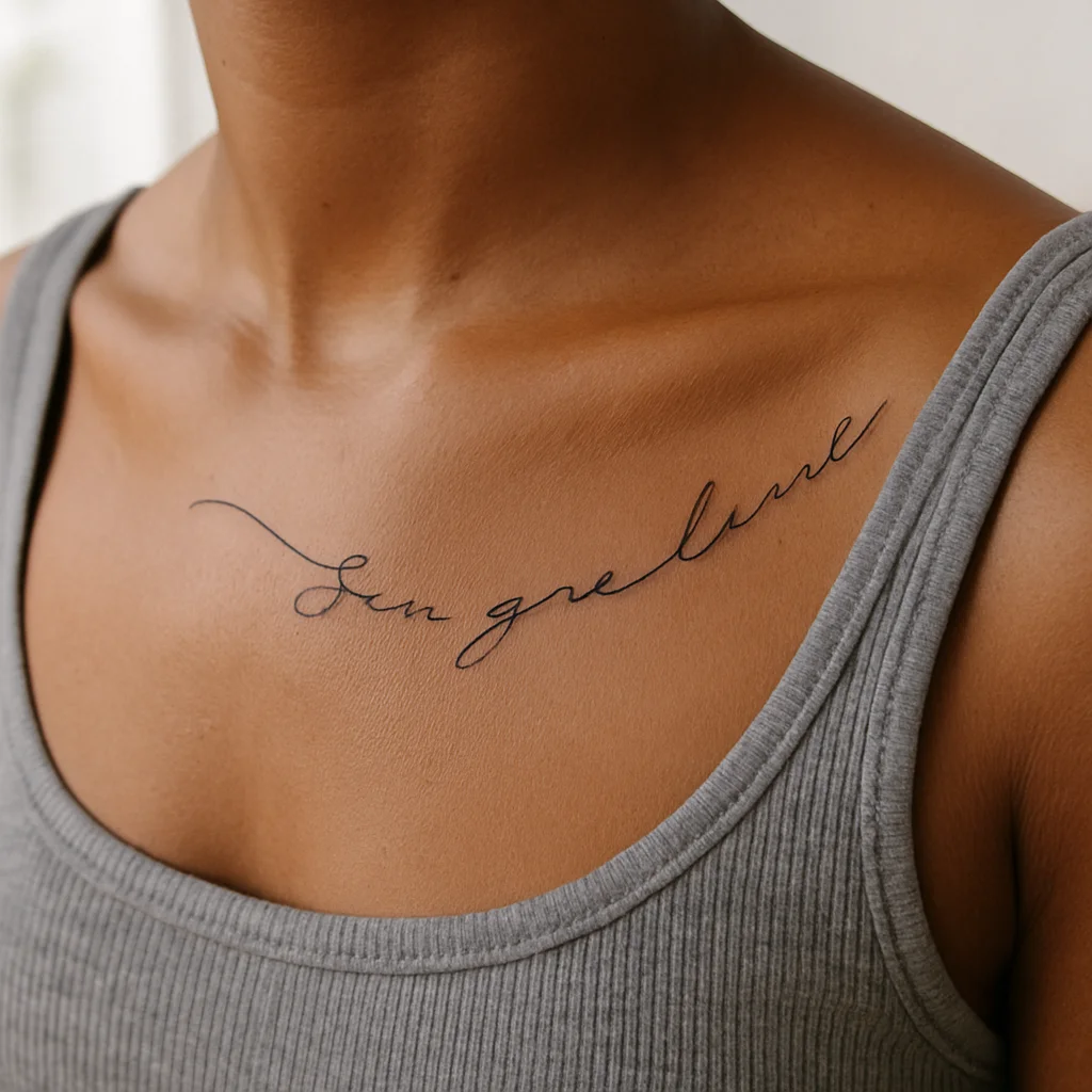
26. A single lyric line following the collarbone
Let it curve with the bone rather than sitting flat across it. One line only — two stacked lines on a moving bone rarely stay tidy.
Abstract and Geometric: 4 Ideas
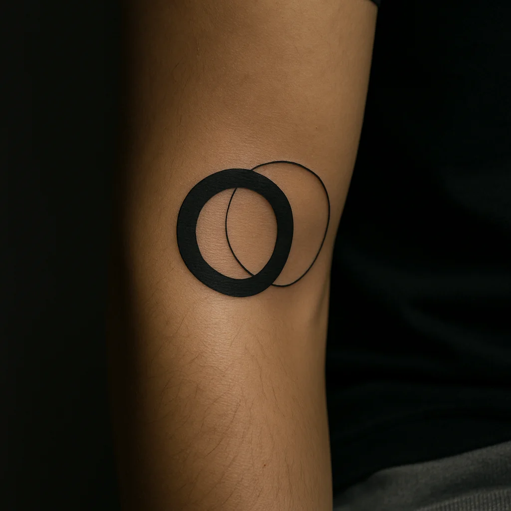
27. Overlapping circles in unequal weights
One solid, one hairline, so the difference does the work. Quiet, and endlessly readable.
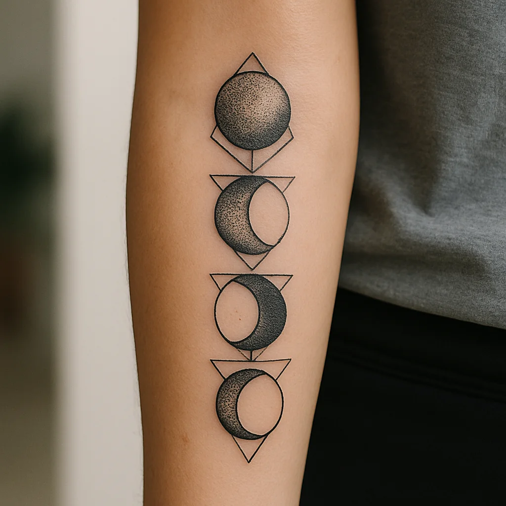
28. Dotwork moon phases
March them up the inner forearm with each moon shaded in stipple only, no smooth grey. The forearm gives the sequence a natural direction.
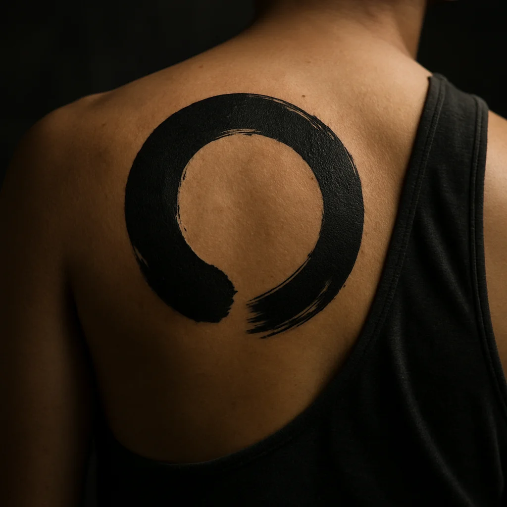
29. Single brushstroke enso circle
Deliberately left open, and done by an artist who can commit to one confident pass. There's nowhere to hide in a design like this.
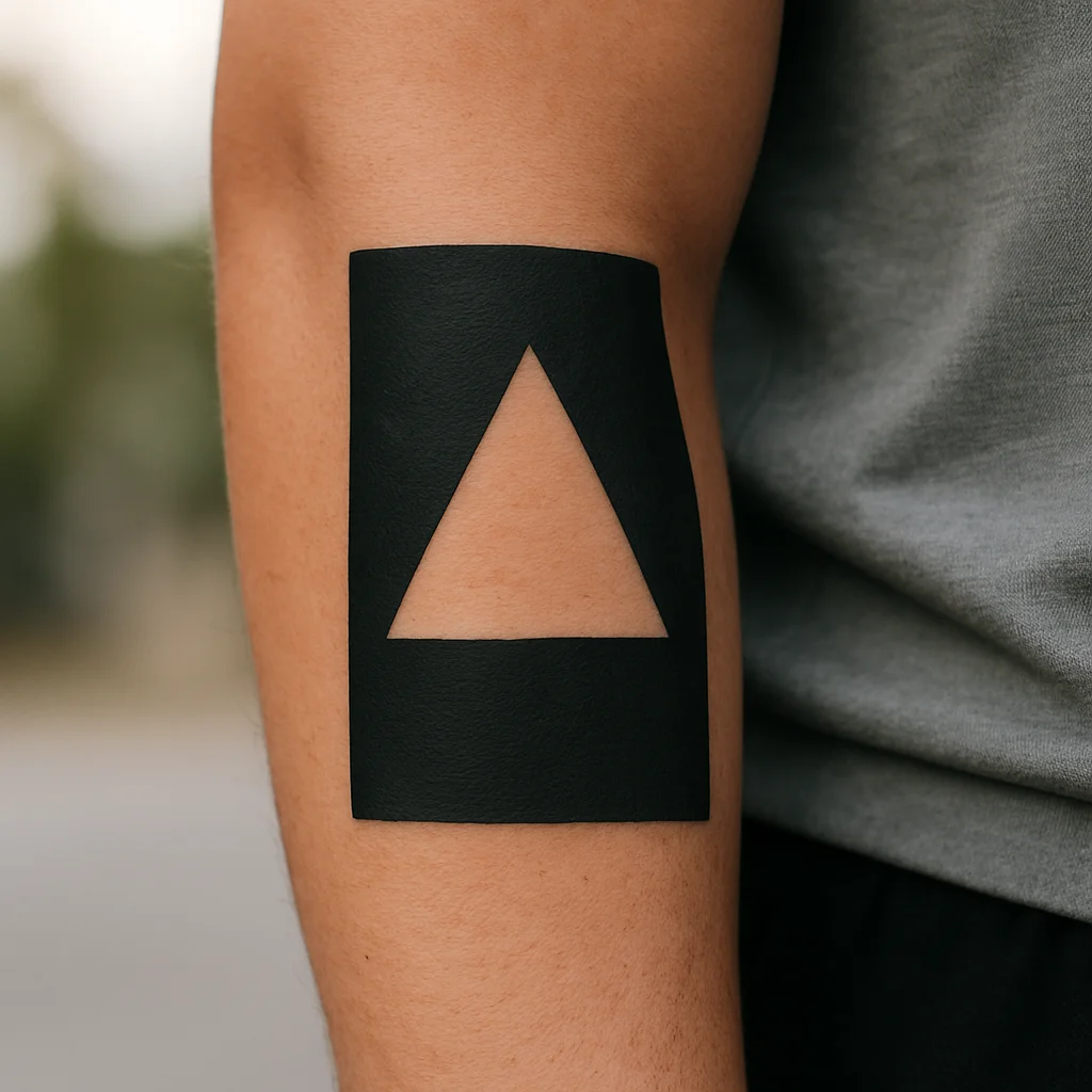
30. Negative-space triangle in blackwork
A solid field with the shape left as bare skin inside it. Dramatic and low-maintenance, but hard to change your mind about later.
Match the Idea to the Body Part
The same design succeeds or fails depending on where it lands. A few working rules artists use:
- Long, linear ideas want long, linear real estate. Fern fronds, moon phases, branches and lettering sit naturally on the spine, forearm, ribcage and calf, where the shape of the body gives the composition a direction.
- Symmetrical designs need a centre line. Moths, arches and mirrored botanicals belong on the sternum, upper back or nape. Put them on a curved outer arm and one side visually collapses.
- Round subjects like the round parts of the body. Circles, moons and portraits sit beautifully on the shoulder cap, outer thigh and shoulder blade.
- High-friction, high-sun areas age hardest. Fingers, palms, feet, the outside of the hand and the top of the shoulder all fade faster. Hands and fingers in particular often need touch-ups within a couple of years; if you want your idea to stay crisp with no maintenance, don't put it there.
- Visibility is a lifestyle decision, not just a style one. Inner forearm, inner bicep, ribs, shoulder blade and thigh give you full control over who sees the piece.
Honest pain expectations
Nobody can promise you a painless spot, but the pattern is consistent. Easier: outer forearm, outer thigh, calf, upper arm, shoulder cap — meaty, well-padded, mostly a dull burn. Moderate: inner forearm, upper back, collarbone edges, ankle bone. Genuinely sharp: ribcage, sternum, spine, inner bicep, nape, top of the foot, hands and fingers. Ribs and sternum tend to be the pieces people talk about years later, partly because of the vibration through bone and partly because breathing makes it hard to relax. Eat properly beforehand, book a morning slot, and tell your artist early if you need a break rather than white-knuckling it.
Size, Style and Line Weight Decide How It Ages
Detail has a floor. Skin spreads ink slightly over years, and lines that sit too close together eventually touch. That's why a heavily shaded moth the size of a matchbox turns into a grey smudge, while the same moth at palm size stays readable for decades.
- Give small ideas air. If your design is coin-sized, cut the internal detail by half. Two or three tones and clean outer shapes beat twelve tiny textures.
- Fine line is a style, not a discount. It looks superb on the forearm, collarbone and ribs, and it needs an artist who tattoos it constantly. Expect softer edges after a few years — that's normal, not bad work. Our guide to fine line tattoo ideas goes deeper on what holds and what doesn't.
- Traditional exists because it survives. Bold outlines, limited palette, strong black shading: the swallow, the anchor, the matchbook will still read across a room in thirty years.
- Blackwork carries weight. Solid fields and negative space are dramatic and low-maintenance, but they're difficult to alter later. Be sure.
- Colour choices matter more than colour itself. Deep reds, mustards and forest greens hold; pale pastels, white highlights and yellow on their own are the first to disappear, especially on sun-exposed skin.
A useful test: shrink your design on a screen until it's the size you plan to get, then step back two metres. If it becomes a grey blob, either scale it up or simplify.
How to Brief an Artist Without Wasting the Consult
Artists want to design; they just need boundaries. A good brief has five parts, and it fits in one message.
- The subject, in one sentence. "A hare mid-leap, no ground line."
- Reference of the subject, not of tattoos. Photos of the real object, plant, animal or handwriting.
- Placement and rough size — point at your own arm and measure it, or mark it with a pen. "Inner forearm, from wrist crease to about here, roughly 12 cm."
- What you don't want. No colour, no script, no dotted background, no framing. Negatives save more time than positives.
- What's flexible. Say plainly that composition, pose and shading are theirs to solve. That single line usually gets you a better tattoo.
On money: pricing works in shop minimums, hourly rates and day rates, and it varies enormously by city and by how in demand the artist is. A small, simple piece usually lands at or near the shop minimum; a detailed forearm or thigh piece will be several hours; a large back or full-arm project runs across multiple sessions and should be quoted as a project, not a per-hour guess. Ask for a range up front, ask whether the deposit comes off the final session, and never choose an artist because they're cheaper — corrections and cover-ups cost far more than getting it right once. For a fuller breakdown, see how much tattoos actually cost.
If an artist redraws your idea in their own hand and it's better than what you imagined, that's the sign you picked the right person.
Protect the Idea After You Get It
The design you chose only stays that design if you look after it. The first two weeks decide the crispness of your lines; the next twenty years are decided by sunscreen.
- Keep it clean and lightly moisturised — wash with unscented soap, pat dry, thin layer of ointment or fragrance-free lotion, two or three times a day. More is not better; a smothered tattoo heals badly.
- Don't pick or scratch the flaking stage. Lifting a scab early takes pigment with it, and patchy fine-line work is a pain to repair.
- No soaking for two to three weeks: no pools, no baths, no sea, no sauna. Showers are fine.
- Sun is the real enemy. Once healed, high-factor sunscreen on exposed placements — forearms, hands, calves, shoulders — is the single biggest factor in how sharp your tattoo looks in a decade.
- Expect a settle. Everything looks slightly softer at four weeks than it did on day one. That's healed skin over ink, not fading. If a section genuinely dropped out, most artists will touch it up; ask after the first month.
Book the touch-up conversation rather than worrying about it. And if you plan to build outward from this piece later — a half sleeve, a thigh panel — tell your artist now, so they leave the composition room to grow.
Frequently asked questions
I like a lot of different tattoo ideas. How do I choose one?
Ask which idea you'd still want if nobody ever saw it. That question removes trend pressure fast. Then check practicality: if two ideas are equally strong, get the one that suits a placement you're comfortable committing to, and keep the other for later — good artists assume you'll be back.
How small can a detailed design go?
As a rough guide, anything with fine internal texture needs to be at least palm-sized to stay readable long term. Below coin size, reduce the design to its silhouette and two or three tones. If your artist says a concept won't hold at the size you want, believe them; they've seen their own work heal for years.
Which placement hurts least for a first tattoo?
Outer forearm, outer thigh, calf and upper arm are the kindest areas — padded, away from bone, and easy to sit still for. Ribs, sternum, spine, feet and hands are the sharpest. Sessions under two hours in a friendly spot are the easiest way to learn how your body handles it.
Can I bring a photo of someone else's tattoo?
Bring it as a mood cue, but expect a reputable artist to decline copying it. Better to bring reference of the actual subject plus a note on the feeling you want, then let them draw it in their own hand. You'll get something that fits your body rather than a second-hand version of someone else's piece.
Is black and grey a safer bet than colour?
It's lower maintenance. Black holds its density longest, and grey wash ages softly rather than patchily. Colour can look spectacular for decades if you stick to saturated reds, greens and mustards and stay serious about sunscreen; pale pastels and white highlights are the first to fade.
More designs to save
30 Tattoo Ideas You Can Actually Take to an Artist
30 Tattoo Ideas You Can Actually Take to an Artist
30 Tattoo Ideas You Can Actually Take to an Artist
30 Tattoo Ideas You Can Actually Take to an Artist
30 Tattoo Ideas You Can Actually Take to an Artist
30 Tattoo Ideas You Can Actually Take to an Artist
30 Tattoo Ideas You Can Actually Take to an Artist
30 Tattoo Ideas You Can Actually Take to an Artist
30 Tattoo Ideas You Can Actually Take to an Artist
The conversation
No comments yet. Got a thought about these designs? Start us off.
Want to weigh in? Join the community to comment, save designs and try them on your skin.